Welcome back! In the previous Lesson, you learned everything there is to know about the different types of composition charts before trying your hand at creating a few yourself for your Cliqz project. Composition charts allow you to compare sizes between different categories of data, as well as in comparison to the entire data set. This comparative nature makes composition charts incredibly common—and useful!—when it comes to conducting analyses, so you’ll be coming across them often in your work as an analyst.
In this Lesson, you’ll be moving on to a different type of chart—charts that track data across time. Time and space are two data elements that provide additional dimensions to your analyses, and they both require different types of visualizations to effectively and efficiently communicate data. You’ll be focusing on time, or temporal, analysis in this Lesson, before moving on to spatial analysis in a few Lessons. You’ll put into action what you’ve learned for the Exercise, where you’ll have an opportunity to conduct a temporal analysis for your Module’s Cliqz project.
Pretty soon, you’ll be able to make any type of visualization you want. Let’s get started!
1. Temporal Charts
Temporal charts show trends across time. In the previous Lesson, you looked at counts (or proportions) of items by category and added additional information by incorporating size and color into your charts. Temporal charts add yet another extra dimension—that of time—by rearranging those same charts. Bar charts, for example, can be used to show time trends. The bar chart in Figure 1, below, shows how you can use the x-axis (the horizontal axis) to represent the year of an event rather than the category:

Figure 1. Timeline of an event
Most often, bar charts are used to show time when there are many categories (groups) and few time points (years), similar to the following example:

Figure 2. Timelines with multiple categories
However, the chart above is liable to make your head spin! It’s simply packed with too much information to be useful. In cases like these, line charts can be used to display the data more clearly:

Figure 3. Line Chart as a better representation of timelines
When working with time, you’re usually going to have many time points—that’s simply the nature of temporal charts. For this reason, you’ll likely notice line charts becoming your go-to chart type when plotting anything that has to do with time. And this includes both historical and future data! One of the great use cases for line charts is forecasting future data, which you’ll be learning all about later on in this Lesson. First, however, let’s take a moment to discuss some line chart basics so you can begin creating your first charts in Tableau.
A Note on Area Charts
Line charts and bar charts aren’t the only options for charting change over time. You also have the option of using area charts. Area charts are similar to line charts, with the difference being that the area beneath the line is filled in with a solid color. This results in a sort of hybrid between line charts and bar charts, as you can see in Figure 5 below:
Figure 4. Area Charts (Source: Wikimedia Commons)

2. Line Charts
A line chart is—as it sounds—a chart that uses a line to represent data. Line charts are most commonly used with time variables, which are charted along the x-axis. The time interval (seconds, minutes, months, etc.) is determined by the data and length of time being displayed.
Suppose you have a data set that keeps track of the number of people visible at a street corner every minute for four days. After entering the data into your data visualization software, you’re given the following chart:

Figure 5. Overloaded Line Chart
What’s this? A solid gray block? This isn’t helpful at all! Your line chart actually has so many lines that they’ve all merged together into one massive block of color. You simply have too many data points for a single chart. Thankfully, there are a few solutions to address this—either you adjust the chart range, or you adjust the interval duration. Let’s walk through both methods!
2.1. Adjusting the Chart Range
One thing you can do to simplify your chart is graph shorter time periods, in other words, shorten the range of the chart. Rather than one big chart, you can create a series of charts that track the data in eight-hour (480-minute) intervals. Take a look at Figure 6, below, which displays the first eight hours of the chart. While still busy, it’s much easier to start identifying some trends in the data:

Figure 6. Line Chart with shorter duration of time
2.2. Adjusting the Interval Duration
Alternatively, you can adjust the interval of the data. Rather than showing every minute, you can have the chart display every hour or even every day. This is called downsampling. More broadly, downsampling is any method that decreases the amount of data. Here, for instance, you’re decreasing the number of samples from 60 per hour (every minute) to 1 per hour (every hour):

Figure 7. Line chart with downsampled data
Another solution would be to aggregate the data. Aggregation is a powerful tool you’ve already used with pivot tables in Excel. It simply refers to the act of clumping data together and calculating the sum or average.
In this example, aggregation will mean taking an average of the data across each hour-long time period. If you look at Figure 8, you can see that this decreases the variability, or range, of the data—in other words, aggregating the data “smooths” it. You’ll explore this some more when learning about forecasting methods.

Figure 8. Aggregating data
Now that you know more about line charts and how to use them effectively, let’s take a look at how you’d go about building one in Tableau!
3. Temporal Charts in Tableau
To practice making your first line chart, you’ll use a data set from the Organization for Economic Co-operation and Development (OECD) on secondary graduation rates. The data set contains graduation and enrollment data for different educational programs across the globe.
Download the secondary graduation rates data set (.xlsx) so you can follow along with the instructions. Once downloaded, navigate to the second tab: grad rate.
Before getting started, let’s take a look at the data variables, as this will help you make some key decisions when setting up your chart in Tableau:
- Column A: Location is displayed as a 3-letter country abbreviation (e.g., CZE).
- Column B: Indicator only has one value—gradrate—which stands for “graduation rate.” This variable isn’t actually necessary and only exists in this data set to maintain consistency across all the OECD’s data sets.
- Column C: Subject represents the subcategory of data, which is split into categories according to gender and school level
- Column D: Measure designates the data unit, in other words, whether the data represents a percentage or a count:
- PC (percentage)
- A (annual count)
- Column E: Frequency represents how often the data is provided to the OECD. It only takes one possible value:
- A (annual)
- Column F: Time represents when the data was collected. In annual data, this is the year the data was collected:
- 2010, 2011, etc.
- Column G: Value represents the graduation rate.
- Column H: Flag Codes represent anything that could be an error in the data. Here, there’s only one possible flag—M—which stands for “missing data.”
Now that you’ve explored the various variables in your data set, let’s go ahead and open the file in Tableau. The process will be much the same as in the previous Exercise:
- Open Tableau and connect to your Microsoft Excel data source.
- Select the grad rate sheet in the left-hand menu.
- Navigate to Sheet 1 at the bottom of your screen.
- Double-click Sheet 1 and rename it “graduation.”
Your sheet is now ready to go! But there’s still your variables to attend to. If you’ll remember from the previous Lesson, you need to ensure that all your variables have been correctly categorized as either dimensions or measures.
Two variables you’ll be working with a lot in this data set are Time and Value (graduation rates), which have both been automatically categorized as measures. Time-based variables, however, are special. They actually have their own variable type in Tableau—Date—and you’ll need to assign it manually. To do so, right-click your Time variable (listed under Measures in your left-hand menu) and select Change Data Type→Date:

Figure 9. Ensure the variable is of “Date” Datatype
The Time variable should now have moved into the upper area on the left, denoting that it’s now a Dimension rather than a Measurement. It should also be sporting a new calendar icon. However, it’s still green, which means it’s still continuous!

Figure 10. Time as a “Dimension”
Tableau Tip: Renaming Variables
If you ever come across a variable name that’s not very descriptive, feel free to rename it directly in Tableau. To do so, right-click the variable name and select Rename, upon which the text will become editable:
Figure 11. Rename a variable
Go ahead and rename the Time variable to Year to be more specific.

Let’s create a visualization that displays the graduation rates for a single country, Germany. You’ll need to start by filtering the data, which will “hide,” in a sense, all the data you don’t need—in this case, data for every country except Germany. Similar to the Marks card you’ve already been working with, there’s a Filters card to which you can drag variables for filtering. Since you want to filter by location, drag the Location variable to the Filter card (located above the Marks card), which will pop up a menu allowing you to select the country or countries you want to see:

Figure 12. Select appropriate data for visualization
Choose DEU, which stands for Germany. Once clicking OK, the Location variable will be visible on the Filter card and have one location listed: DEU:

Figure 13. Filter applied for Germany
You already know that you want to look at graduation rates across time. You also know that line charts always display time along the x-axis. This means you’ll want to place your time-based variable on the Columns shelf. Your time-based variable in this example is the Time variable that you recently renamed to Year, so go ahead and drag it over to the Columns shelf:

Figure 14. Bring time to Columns Shelf
Your chart is starting to take shape, though it’s not very interesting yet. One thing it does show, however, is that there’s data missing between 2006 and 2009—there’s no line for these years.
Discrete and Continuous Variables
At this point, your Year variable should be displayed in green. This means that Tableau is treating it as a continuous variable. If you notice, however, that your Year variable is blue, this means Tableau is treating it as a discrete variable. This will make your visualization look a bit different.
Figure 15. Year treated as Discrete
To change a discrete variable into a continuous variable (and vice versa), simply click the down arrow next to the variable name and select Continuous from the dropdown list:
Figure 16. Year converted to continuous


Next, you need to tell Tableau which data you want to display across years. Graduation rate is stored in the Value variable. Like the Time variable, this name is a bit ambiguous. We recommend you rename this variable to something more meaningful; for instance, Graduation Rate. Once renamed, drag it to the Rows shelf.
Moving it to the Rows shelf will add a new SUM() aggregation. This is because, by default, Tableau always aggregates, or “clumps” data. You’ll turn this feature off in some future Lessons, but in many charts (including this one), this aggregation is preferable—you only want one number per year, not every data point for that year:

Figure 17. Whenever you see the name of a variable within a SUM() formula, this means that your data is currently aggregated.
You can change the aggregation by clicking the down arrow next to the variable name and choosing Measure. This will bring up a list of other aggregations you can perform, such as Sum, Average, Median, and Count. If you were to change the aggregation from SUM() to AVERAGE(), the graph would change. This means that Tableau is, indeed, aggregating multiple data points (if there were only one data point per year, the sum and the average would be the same).

Figure 18. Changing aggregation
Now that you’re displaying graduation rates across years and have filtered to a single country, you need to select the subject of interest. Let’s quickly look at the Subject variable in a bit more detail as this will be very significant in your analysis. This variable covers two different groups—graduation rates from upper-secondary schools (total and by gender) and graduation rates from post-secondary schools not including tertiary education (total and by gender).
- UPPSRY: Upper-secondary school
- UPPSRY_MEN: Upper-secondary school, men
- UPPSRY_WOMEN: Upper-secondary school, women
- P_SRY_NTRY: Post-secondary school, non-tertiary
- P_SRY_NTRY_MEN: Post-secondary school, non-tertiary, men
- P_SRY_NTRY_WOMEN: Post-secondary school, non-tertiary, women
School Terminology
You may be scratching your head at some of these school-related terms, especially if they’re not used in your country:
- Tertiary education refers to universities, colleges, or trade schools.
- Upper-secondary education refers to high-school or level-three education.
- Post-secondary, non-tertiary education refers to any education that prepares someone for tertiary education—or for the labor market. It includes programs such as vocational or technician certifications.
The array of options makes it difficult to know what to choose. This often happens in analysis when you’re working in an unfamiliar subject. Visualization can help! In this case, what you can do is visually examine the options before making a decision on how to display everything.
In a line chart, you can view multiple categories by dragging the category variable (in this case, Subject) from your variables list onto either the Detail or Color boxes on your Marks card. Dragging to Color gives each subject a unique color, making it easy to distinguish the categories. Dragging to Detail would place each subject on its own line; however, each line would be the same color, making it harder to distinguish which line belongs to which subject.
Let’s drag the Subject variable to the Color box for now. Be sure to hide your Show Me menu so you can see the color legend in the top-right corner:

Figure 19. Plotting Subject
Already, it’s easy to see that more students graduate from upper-secondary schools than from post-secondary schools—the graduation rates for secondary, non-tertiary schools are in the 20s, whereas the graduation rates for other schools are in the 80s and 90s. You might be able to assume from this data that the secondary, non-tertiary schools are more difficult to graduate from or contain more-advanced subjects than upper-secondary schools!
3.1. Checking Your Data
Just like with your previous charts, take a moment now to check whether your current choice of chart does a good job of communicating your data. Here, you’re working with time data, examining graduation rates across years. You already know that time data is most commonly visualized as a line chart. (In fact, Tableau usually defaults to a line chart when a time variable is present.) Also, by adding the Graduation Rate variable to your Rows shelf as an average, you’ve ensured that each year is only represented by one data point per line (rather than multiple data points per year, per line). Your chart type (line) fits the data (temporal trends) and shows the level of information you want. Perfect!
One aspect of data you explored in the previous Achievement was the level of aggregation. In the influenza data you worked with, you began with data for multiple geographic levels (because totals were included in the original data sets). Similarly, in the education data you’re working with now, there’s both data at a gender level and overall totals for each category. Including both of these levels of data would be confusing. It would make more sense to only show the totals or only show the rates by gender—but not both at the same time! For the time being, however, let’s start by simply relabeling your variable names to be more descriptive. This will make it easier for viewers to interpret your chart.
You already know how to relabel a variable. Now, however, you want to relabel the individual values of a variable. To do so, right-click the Subject variable in your Dimensions area and choose Aliases:

Figure 20. Renaming individual values of a variable
This will bring up a dialog listing each of the six categories for your Subject variable:

Figure 21. Renaming values
From here, you can individually click on entries in the Values (Alias) column and type new, more-descriptive names. We recommend the following labels:
| Original Label | Descriptive Label |
|---|---|
| UPPSRY | Upper-Secondary: Total |
| UPPSRY_MEN | Upper-Secondary: Men |
| UPPSRY_WOMEN | Upper-Secondary: Women |
| P_SRY_NTRY | Post-Secondary, Non-Tertiary: Total |
| P_SRY_NTRY_MEN | Post-Secondary, Non-Tertiary: Men |
| P_SRY_NTRY_WOMEN | Post-Secondary, Non-Tertiary: Women |

Figure 22. Go through the list of aliases and rename each one to something more descriptive.
Once finished, you’ll see your changes reflected in the chart color legend in the upper right-hand corner.
3.2. Adjusting the Colors and Labels
Now’s a good time to revisit your colors. Currently, Tableau has simply assigned some default colors to your categories; however, as you already know, this likely isn’t the best way to display your chart. How might you use color to ensure your chart is as easy to interpret as possible?
There’s already a natural grouping to your data in the form of your Upper-Secondary and Post-Secondary, Non-Tertiary categories. Another possible grouping could be between men and women, but for now, let’s focus on the two different types of education. (Feel free to additionally play around with this second gender-based grouping to see how the final chart compares to the education-based grouping!) Users will be able to easily see and interpret these groups if you use a different color for each group. Change the colors using the Color box on your Marks card. In the image below, we’ve chosen a set of analogous colors (blue and purple) because they go together nicely; however, feel free to choose a different set of colors should you so desire. Just make sure to follow the color guidance principles you learned about in Lesson 2: Visual Design Basics & Tableau!
Below, a monochromatic purple scale has been used for the Upper-Secondary grouping, and a monochromatic blue scale has been used for the Post-Secondary, Non-Tertiary grouping. To select multiple categories at the same time, hold down the Shift key, then choose the color palette you want from the dropdown menu and click the Assign Palette button:

Figure 23. Changing color palette
Once finished, click OK to apply your new color palettes to the visualization, then take a look at your updated color legend:

Figure 24. Category colors updated
Do you notice anything odd about the current color configuration? The total is in the middle—neither the darkest nor lightest hue—however, if you’ll recall from Lesson 2, the eyes are drawn to darker colors. This means that viewers’ eyes will be drawn not to the total amounts, rather, the graduation rates for women. This doesn’t seem correct given that the totals are your most important categories (while gender breakdown does provide additional information, the main focus is still on overall graduation rate).
Let’s fix this by making your totals be the darkest colors on the visualization. This can be done by way of a data sort (which will be faster than simply changing all the colors manually). Right-click your Subject variable, then navigate to Default Properties from the dropdown menu and select Sort:

Figure 25. Sorting data
This will bring up the Sort modal. Under Sort By, choose Manual, then rearrange the variables, ensuring that Total is the last item in each group:

Figure 26. Because of the long names, it may be hard to differentiate which category is which. In this case, simply hover over the name of a category to view its full name.
Once finished, return to the Color box on your Marks card and reassign your color palettes (repeat the steps for assigning color palettes to your two groupings). This will update the colors on your chart, making it easier to interpret at a glance:

Figure 27. Colors updated to draw attention to “Totals”
Great job on your colors! There’s still, however, the labels to attend to. While line charts don’t typically include labels for every point and color like pie charts, you’ll likely still want to highlight certain data—for instance, it’s very common to highlight the minimum and maximum values on a chart. Open up the Labels modal by clicking on the Label icon on your Marks card. From there, check the Show mark labels box at the top of the modal and choose Min/Max under the Marks to Label section:

Figure 28. Adding labels to your line chart
You’ll now see two labels on your chart identifying the minimum and maximum graduation rate values, which will give your viewers a bit more information to work with when reading your chart (making it easier for them to interpret).
Before moving on, let’s also give your graph a better title. Double-click the title of your graph and type in something more descriptive, for instance, “German Graduation Rates.” Once finished, your graph should look like the following:

Figure 29. Giving title to the chart
3.3. Formatting the Axes
One thing you may have noticed is that the y-axis of your graph says Avg. Graduation Rates. In addition, it’s showing numbers rather than percentages. Let’s fix this to avoid any ambiguity.
Double-click the y-axis to bring up the Edit Axis modal. Start by changing its title: from “Avg. Graduation Rate” to simply “Graduation Rates.” While it’s true that this axis represents an average, because there’s only one data element being averaged, this is an unnecessary qualifier. The aggregation could be SUM, and the results would be the same. The data could have no aggregation, and the results would be the same. This is simply one of the idiosyncrasies of Tableau (that it requires aggregation).

Figure 30. Adjusting Axis titles
Now, let’s tell the axis to display percentages rather than numbers. The method for this is similar to what you did earlier to sort the categories. Right-click the Graduation Rate variable in your Measures list, then select Default Properties→Number Format from the dropdown menu:

Figure 31. Adjusting number format
This will pop up a Default Number Format dialog with a number of different options to choose from. While your first inclination is probably to choose the Percentage option, this will lead to graduation rates somewhere around 2000 percent. This is because your numbers are technically percentages already, so they don’t need to be multiplied by 100 (which is what choosing the Percentage option does). Instead, you simply want to format your data so it displays like a percentage by adding a percent sign. To achieve this, choose Number (Custom), then change Decimal places to “0”and add a Suffix of “%”:

Figure 32. Formatting your numbers
Once you click OK, your chart will update, and the y-axis will look as though it’s clearly displaying percentages. Great!
3.4. Considering the Scale
You’ve probably noticed this already, but there’s a bit of a gap between your two groupings of data (Post-Secondary, Non-Tertiary and Upper-Secondary), making the chart look disjointed. One way to fix this would be to allow users to choose which group to visualize at a time, which can be done by way of a filter. Drag your Subject variable from the Dimensions list onto the Filters card and click OK on the resulting modal that pops up. Then, click the down arrow next to the variable name and choose Show Filter:

Figure 33. Filtering data for selective visualization
This will bring up a new filter menu above your color legend, allowing you to easily select which categories to display on your chart at a time. There’s one small problem, though: you simply want to switch each grouping on and off—not each individual category! To achieve this, you need to create groups for your filters. Head back to the dropdown menu for your Subject variable and choose Create→Group:

Figure 34. Group data
This will bring up another dialog. You want to create two groups: one for your Post-Secondary, Non-Tertiary categories and one for your Upper-Secondary categories. Hold down the Shift key to select all three categories for the Post-Secondary, Non-Tertiary group, then click the Group button at the bottom of the dialog. Immediately after clicking this button, you’ll be asked to type a name for this group (“Post-Secondary, Non-Tertiary” works well). Once finished, repeat these steps for the three Upper-Secondary categories, as well:

Figure 35. Group data
After you click OK, Tableau will create a new variable in your Dimensions list called Subject (group). The paperclip icon to the left of it signifies it as a grouping:

Figure 36. Group created
Drag this new variable on top of the existing Subject variable on the Filters card. This will replace the Subjects filter you created earlier with the new Groups filter you just created. In the dialog that appears, select both groups, then click OK:

Figure 37. Subjects represented as groups
At this point, the filters above your color legend will probably disappear. To get them back, click on the Subject (group) variable in your Filters card and select Show Filters. You should now see three options in your filters: (All), Post-Secondary, Non-Tertiary, and Upper-Secondary. Click and unclick each of these groups to see how your chart changes. Note that the axis range automatically adjusts based on which group is being displayed. The labels also adjust to show the minimum and maximum values in the view:

Figure 38. Selecting group to visualize
Nicely done! You’ve just created your first temporal visualization in Tableau. Already, it’s easy to see how visualizations can help viewers interpret data more quickly. For instance, there are a number of missing years in this data. Prior to this missing data, graduation rates were trending upwards. After the missing data, graduation rates began trending downwards. It would be interesting to investigate what might have happened during these years that could have altered the trends. You can additionally make observations regarding graduation rates between women and men. For instance, while graduation rates for men and women alternate when it comes to upper-secondary school, graduation rates for women are always higher when it comes to post-secondary, non-tertiary school.
In summary:
- Use bar charts to visualize time if there are only a few time points and many categories.
- Use line charts to visualize time if there are many time points.
- Adjust the frequency or number of data points so that the chart clearly shows a line, rather than an indecipherable blob.
4. Forecasting
The word “forecasting” likely brings to mind images of weather and meteorologists predicting temperatures for upcoming weeks. Meteorologists make these predictions using a variety of historical data such as temperatures from recent days or snowfall from the same time of year in past years. You can say, then, that they’re using the past to predict the future. You can do the same thing!
Forecasting refers to any kind of future prediction—not just weather—and there are many methods for making these predictions. In this Lesson, you’ll learn about some of the most common methods, along with how to implement them in Tableau.
4.1. Linear Extrapolation
Linear extrapolation is one of the simplest methods of forecasting—and one you may have learned about before in math class. In linear extrapolation, you draw a line through a series of existing data points and follow this line out to a future state.
Consider the simple line chart below, which graphs the count of an event across a number of years. If you want to make an educated guess, or forecast, of how the line might continue to move in the future, you could add a line of best fit, or a trend line, that intersects the data at the minimum distance from each point:

Figure 39. A trend line passes through an entire graph at the minimum distance from each point.
In this example, only a few data points actually intersect the line; however, taken as a whole, the line describes the movement of the data across time, following the x-axis. How does this relate to forecasting? Well, if you extend this line past the graph itself, you can use it to predict where a point in the future might reside.
As you can see in this example, however, linear extrapolation doesn’t work as well with data that has considerable variability—in other words, a lot of peaks and valleys (very high points and very low points respectively). A single linear line simply can’t follow these peaks, and, instead, has to follow the road of least resistance straight through the middle. In a graph with many large peaks and valleys, like the chart above, linear extrapolation isn’t the best choice (it simply doesn’t represent the variability of the graph well enough). It can, however, work well for charts with limited variability. Its also incredibly easy to do: most tools, from Excel to Tableau, can create a trend line for you.
4.2. Averaging
Another method of forecasting is called averaging. There are two main methods when it comes to averaging. The first involves taking an average of historic data, and using this single number to predict the future. Suppose, for instance, that every holiday season you receive gifts and keep track of how many you receive. Some years you receive a few less, and some years a few more. If you wanted to predict how many presents you’d receive in the upcoming year, you could simply take an average of how many gifts you received in years past.
The other method of averaging is a bit more complex. Fast-forward, and now you’re all grown up and living with your own family, with holidays focusing on these little ones instead of you. While you might still receive some gifts, this will be fewer than the amount you received growing up as a child. If you were to follow the above method of averaging the number of presents you received each year since you were born, your gift prediction for the upcoming year would be too high. In this scenario, you could put more emphasis on recent years—in other words, you could weight recent years more heavily. Rather than treating the gift count of each year equally, you could give recent years a weight of 80 percent and your childhood years a weight of only 20 percent, which would give you a more accurate prediction. This is called a weighted average.
4.3. Exponential Smoothing
Another common forecasting method—and the one that Tableau uses—is called exponential smoothing. Exponential smoothing can be thought of as a combination of linear extrapolation and averaging. Consider the following set of multiplication equations:
- 2*1 = 2
- 2*2 = 4
- 2*3 = 6
- 2*4 = 8
The results grow slowly from 2 to 4 to 6 to 8, with 2 being added to each prior number to attain the next number. Now, consider what would happen if you squared these same numbers:
- 12=1
- 22=4
- 32=9
- 42=16
The results grow much faster, now, going from 1 to 4 to 9 to 16. In addition, unlike the previous equations, the difference between each number isn’t consistent. The difference between the first two numbers, 1 and 4, is 3, while the difference between the second and third numbers, 4 and 9, is five. This is called exponential growth.

Figure 40. Each of these buildings is exponentially taller than the one before.
Exponential smoothing works in the same way by using a scaling factor that exponentially weights historic time points. The most recent years (i.e., last year’s present count, to refer back to the present example) have the highest weight, say 16, while the years prior to that have a weight of 9, the years prior to that have a weight of 4, and the years prior to that (the first couple of years you received presents) have a weight of 1. These weights are the scaling factors—the higher the weight, the more that year is emphasized.
Because data trends usually change significantly over the years, more-recent data is usually more relevant to the current year. Exponential smoothing and weighted averages can both address this aspect, but exponential smoothing requires less judgment. Weighted averages require the analyst to know the comparable weights, and thus might be used by more-senior or experienced analysts
4.4. Seasonality
The final core component of forecasting is the idea of seasonality. The farther you live from the equator, the more drastically you experience the seasons. On one extreme is the heat and sun of summer, and on the other extreme is the cold and snow of winter. If you wanted to accurately guess the temperature on a random day of the year, you’d first need to know in which season that day falls. Your prediction would be much lower if that day were in winter, for example, than if that day were in summer. In this way, there’s a predictable, repeatable, seasonal pattern to the data.

Figure 41. Sale figures for Christmas trees, toys, and even certain types of beverages (we’re looking at you, Pumpkin Spice Latte!) would also be affected by seasonality.
You’d be surprised just how much data displays this element of seasonality. Consider school graduations—most schools only graduate students one (or potentially two) times per year. And what about your influenza data? People are more likely to get the flu in colder seasons such as fall and winter. This, too, is seasonality. When forecasting this type of data, you want to incorporate seasonality into your predictions. If you know the frequency of your data’s seasonality (e.g., annually, monthly, etc.), your forecasting tool (in this case, Tableau) will usually be able to incorporate it into future predictions.
4.5. Forecasting in Tableau
Fortunately for you, forecasting in Tableau is quite simple. You already created a fancy line graph for the graduation rates in your data above. Now, let’s look at the second tab in your data set, which looks at enrollment rates, as you walk through how to create a forecast for your data.
Head back to Tableau and connect to another data source by opening the Data menu from the top toolbar, then selecting New Data Source. Connect to the same OECD data, but this time, choose enrollment from the list of sheets in the left-hand menu. This second sheet contains enrollment data for students of different ages. Once you’ve connected, create a new sheet call enrollment.
![]()
Figure 42. Once created, you should see your new “enrollment” sheet next to your “graduation” sheet.
Before getting started, let’s take a look at the data variables. Conveniently, the data is structured very similarly to the graduation rate data:
- Column A: Location is displayed as a three-letter country abbreviation (e.g., CZE).
- Column B: Indicator only has one value—enrollment—which stands for “enrollment rate.”
- Column C: Subject represents the subcategory of data, which is split into categories according to age:
- AGE_17
- AGE_18
- AGE_19
- Column D: Measure designates the data unit; in other words, whether the data represents a percentage or a count:
- PC_AGE (percentage)
- Column E: Frequency represents how often the data is provided to the OECD. It only takes one possible value:
- A (annual)
- Column F: Time represents when the data was collected. In annual data, this is the year the data was collected:
- 2010, 2011, etc.
- Column G: Value represents the enrollment rate.
- Column H: Flag Codes represent anything that could be an error in the data. Here, there’s only one possible flag—M—which stands for “missing data.”
The data follows the same structure as the data for graduation rates, so you can follow a similar set of steps for getting it set up in Tableau:
- Change the Time variable to the Date variable type and give it a more descriptive name: Year.
- Give the Value variable a more descriptive name: Enrollment Rate.
- Limit the data to Germany by adding the Location variable to the Filters card and selecting DEU.
- Add the Year variable to the Columns shelf and the Enrollment Rate variable to the Rows shelf.
- Visualize the data categories by dragging the Subject variable onto the Colors box on the Marks card.
Upon finishing, your chart should look like the following, with each category of data (age) visualized by a separate line:

Figure 43. Enrollment rate over time
As Tableau’s default colors of blue, orange, and red don’t follow the design color guidelines, let’s go ahead and change them to something more suitable, such as a monochromatic gray scale. Unlike the previous chart, where it was important that the totals be a darker color, none of these categories are more important than the others. As such, it doesn’t matter which are lighter and which are darker. In the example images below, we’ve given AGE_17 the lightest color and AGE_19 the darkest color, but this isn’t a requirement:

Figure 44. Adjusting colors
Suppose you work for an education program and the management wants to know how many students they might expect to enroll next year, as this would influence how many additional staff members they need to hire. Let’s walk through what you’d do if you were the analyst tasked with producing this forecast.
In Tableau, open up the Analysis menu from your toolbar at the top of the screen, then select Forecast→Show Forecast:

Figure 45. Opening Forecasting menu
Tableau will automatically forecast the data, showing future estimates with lines and shading. While the actual data only went through 2017, Tableau has created a forecast that includes enrollment rates up through 2018:

Figure 46. Tableau forecasting enrollment rates
Note also that Tableau reverted the colors of the graph back to its initial colors. Change these back by, again, clicking the Colors box on the Marks card and adjusting the colors for the forecast. Once finished, your graph should look something like this:

Figure 47. Tableau forecasting visualized in desired colors
You can read about and adjust the forecasting options via the same menu in which you turned on the forecast: Analysis→Forecast→Forecast Options:

Figure 48. Specifying forecasting options
This will bring up a dialog with forecast information. Here, Tableau informs you it will forecast two years automatically; however, if you want to, you can manually change that interval to forecast only one year or to forecast more than two years.
Under Forecast Model, you’ll see that Automatic has already been selected. This option includes exponential smoothing with seasonality. If this isn’t what you want, you can create a custom model via the dropdown list. As the data you’re working with is annual, seasonality is unnecessary. In most scenarios, including seasonality will usually net the same result as not including seasonality—whether the underlying data is affected by seasonality or not!
Conversely, excluding seasonality when the data is affected by it will lead to poor forecasts. For this reason, we generally recommend using seasonality whether your data is affected by it or not.
The shading you noticed earlier in your chart represents the prediction interval, which is, in essence, a confidence range. Tableau makes an estimate of a value (the line on the chart for the forecast) but gives you the 95% confidence range (the shading around the line). You can change this confidence range (using the dropdown menu) or remove it entirely by deselecting the Show prediction intervals check box:
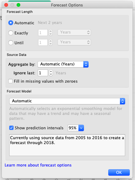
Figure 49. Configuring forecasting options
You can’t assess the accuracy of a forecast until the event happens and becomes, well, the past. However, most organizations want to plan for the future, and forecasting is an important component of that planning. Your Cliqz executives ask you to forecast query traffic, and you have historic counts you can use to predict the future.
