Lesson 3 - Composition & Comparison Charts
Estimated Read Time: 3 Hours
Learning Goals
In this lesson, you will learn to:
- Discuss use cases for composition and comparison charts
- Create a comparison chart
Welcome back! You spent the previous two Lessons learning why data visualization is such an important aspect of a data analyst’s role and duties—as well as how powerful it can be as a means of communicating important information to non-data-savvy and data-savvy stakeholders alike. Data visualizations are a dynamic tool you can use during your analyses to uncover new insights about the data you’re working with.
In the previous Lesson, you explored some fundamental principles for designing effective visualizations, ensuring that they’ll be able to properly and efficiently communicate the information they’re trying to convey. Text and color, for example, can support the data if used well but detract from the data if used poorly. To that end, you took a look at how you can use the color wheel to choose harmonious and meaningful colors that will enhance your visualizations.
With all of that introductory material out of the way, it’s finally time to dig into the nitty gritty details of the different types of visualizations out there and what they’re used for. As you progress through this Module, you’ll learn not only how to create different visualizations, but also how your data can actually drive the type of chart you choose. Along the way, you’ll practice applying the design principles introduced in the previous Lesson to the visualizations you create.
In this Lesson, you’ll be given a brief overview of the different types of visualizations you may encounter before looking specifically at composition and comparison charts (what they are and their ideal use cases). Ready to get started? Then, let’s go!
SAVING YOUR WORKBOOK
In this Lesson, you’ll learn how to create certain charts in Tableau using a sample data set for different types of candy and their popularity. We encourage you to follow along with the instructions in this Lesson to practice visualizing data in Tableau before using it to visualize your project data in the task.
You’ll be using the visuals created in this Exercise from the candy data again in Lesson 2.9: Storytelling with Data Presentations, so be sure to save your Tableau workbook for this Lesson before moving on to the task. You’ll find instructions for how to do so at the end of this Lesson.
Use a descriptive title to indicate that the workbook contains the sample project for this Lesson. With your workbook for this Lesson saved, you’ll be able to easily retrieve what you’ve done and continue to work on it as needed later on in the Module. Keep in mind, though, that you can’t copy sheets between workbooks in Tableau public!
1. Types of Visualizations
As you’ve already seen from your exploration of Tableau Public in the previous task, there are a lot of different types of data visualizations. Throughout this Module, you’ll learn not only what these types are but also what data they’re most applicable to. A different type of visualization will be introduced in each Lesson, with the groupings as follows:
1.1. Composition Charts
Composition charts focus on how the different parts of a data set compare to the whole (appropriately, they’re sometimes referred to as comparison charts). You can think of them as indicators of proportion—for example, what proportion (or percentage) of a population plays an instrument? Of those who play an instrument, which instrument do they play?
Looking at proportions and comparing group sizes is a common activity for data analysts, which is what makes composition charts one of the most common chart types out there. Pie charts, bar charts, column charts, stacked bar charts, and treemaps are all examples of composition charts, and you’ll be exploring each one of these in more depth later on in this Lesson. Here’s a preview of each type of composition chart in its simplest format (without any labels):
1.2. Temporal Charts
Temporal charts are those that include some sort of time component. In most analyses, time as a variable requires special consideration. For this reason, there’s a whole group of charts available specifically for displaying data over time.
The most common temporal chart is the line chart. By their very nature, line charts display data over multiple time periods, with the most typical format indicating time along the horizontal (or x) axis:
Temporal charts can be used to display not only historical data, but also future data—this is called “forecasting.” You’ll be learning about some of the different methods to create these forecasts later on in this Module.
1.3. Statistical Charts
Statistical charts are similar to composition charts in that there are many different types of visualizations that fall under this category. They do, however, share one common purpose: to display some statistical aspect of the data. You’ve already learned about data distribution and skew, as well as what these concepts look like visually on a column chart. You’ve also looked into frequency distributions, which are usually represented visually in a specific type of column chart called a histogram. You know how to look for relationships between variables by calculating their correlation. Correlations can be examined visually using charts called scatterplots. All of these charts, no matter how different they may seem, fall under the category of statistical charts because of their statistical nature. You’ll be looking at a few different types of statistical charts, including histograms and scatterplots, later on in this Module.
1.4. Geospatial Charts
You probably know geospatial charts by their more commonly used name — maps. Maps are used for more than just navigation and are an excellent way to perform spatial analysis (i.e., comparing something across regions). For this purpose, there are choropleth maps, dot (or distribution) maps, and heat maps, each of which can be used for different purposes:
1.5. Textual Analysis
Textual analysis is the only category that focuses on qualitative analysis. Qualitative data is usually non-numeric and relies on the senses: what you see, smell, taste, hear, or feel. As you might imagine, creating a visualization for this type of data could prove difficult as it doesn’t make use of numbers! One of the more-frequently used types of visualizations for qualitative data is the word cloud, which displays common words and phrases found within a data set according to their frequency (the larger a word or phrase, the more times it exists within the data):
2. Composition Charts for Comparison
Now that you’ve previewed what types of visualizations you’ll be looking at over the course of this Module, let’s focus on the first category of charts you’ll be exploring: composition charts. Composition charts commonly come in the form of pie charts, bar/column charts, and treemaps. You’ll be digging into the specifics of each one below, by exploring not only best practices for each chart, but also how to set each one up in Tableau.
2.1. Data Requirements
As a general rule, composition charts focus primarily on categories or groups. This is in an effort to illuminate any differences in size between these categories or groups.
Before jumping straight into making a chart for your Module project, let’s walk through how to create a composition chart in Tableau using a simpler example — in this case, the candy data set introduced in the previous Lesson. You’ll want to load the data set into Tableau following the same procedure as in the previous Exercise:
- Select Microsoft Excel as the data source.
- Load the “candy-data.xlsx” file.
- Go to Sheet 1 to start exploring the data.
A Tableau document (which is what you’ve created here) is made up of multiple sheets. The Tableau document you’ve set up now only contains one sheet, Sheet 1, which will allow you to create one visualization. When you need to make a second visualization (or third, fourth, fifth, etc.), you’ll need to create a new sheet for each one. On each sheet, you first select the variables you want to include in your visualization, then configure Tableau to generate the appropriate visualization. Remember that you can’t copy a sheet to a different Tableau document with the public version, so keep in mind when working with multiple data sources or documents that you may need to recreate some sheets.
Before you can build your charts, however, you first need to know a little bit more about the data set you’re working with. This will allow you to choose the appropriate variables and configurations. To that end, let’s take a closer look at your candy data set.
The candy data comes from the FiveThirtyEight blog and is the result of 8,371 people voting on random matchups between candy types (with the ultimate outcome being to select their favorite type of Halloween candy). Two candies are pitted against each other at a time, and each of the 8,371 people vote on which one they prefer. These votes are then tallied so that each candy type has a single number representing the percentage of matchups in which it won.
The candy types themselves come with descriptive variables indicating their contents—such as whether they contain chocolate or caramel — as well as variables representing sugar content, relative price, and manufacturing company.
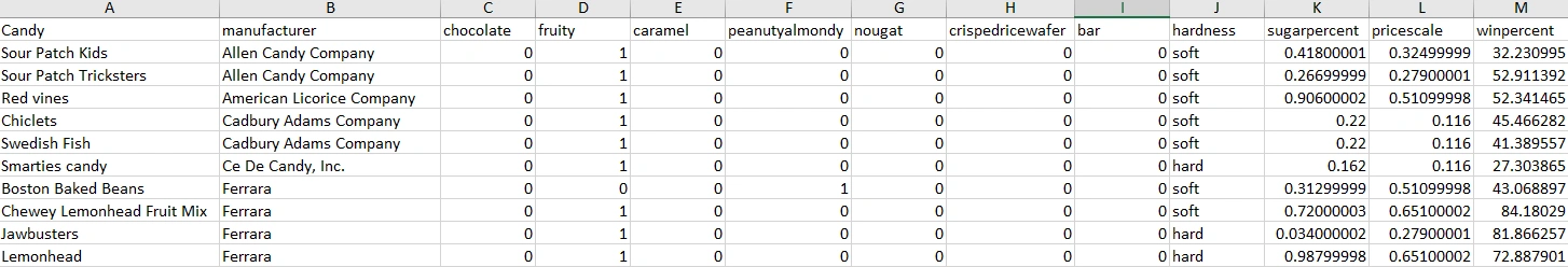
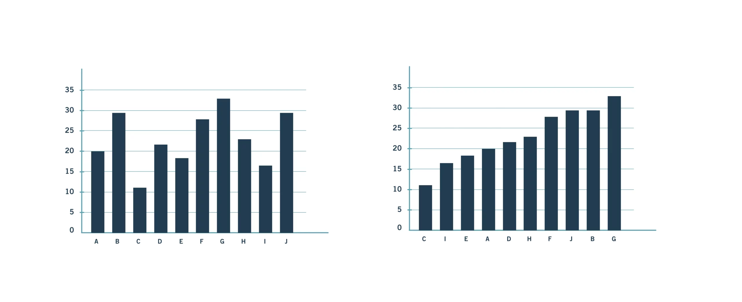
Take a minute to open the Excel file and look at the data yourself. You should always check your raw data, either by looking at it directly in Excel or by looking at the overall statistics of the data (if the data set is too large). Trying to work with data you don’t understand yet will only lead to you needing to rework your visualizations once you do understand it.
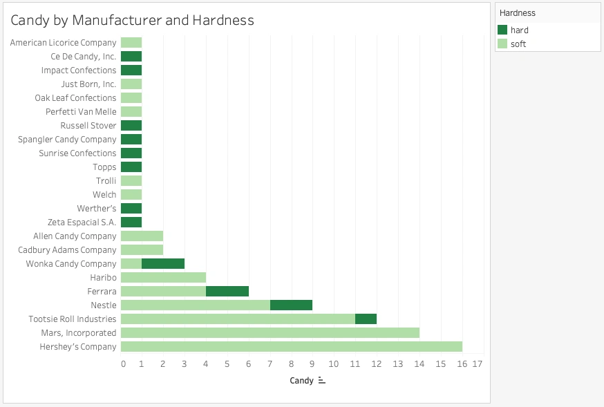
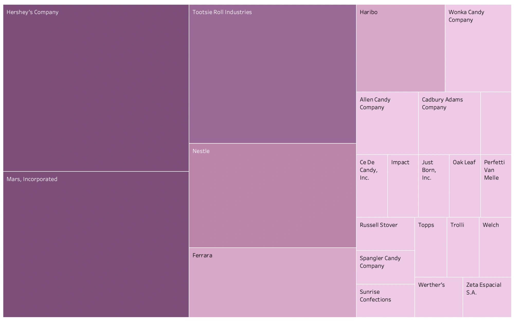
Notice that some of the columns include text (e.g., “manufacturer” and “hardness”), others contain continuous numbers (e.g, “sugarpercent,” “pricescale,” and “winpercent.”), and the rest only include 1s and 0s (e.g., “chocolate,” “fruity,” “caramel,” etc.).This 1s-and-0s nomenclature is commonly used in data sets to represent yes/no or true/false answers. They’re what are known as “indicator variables.” In the chocolate column, for instance, the 1s signify that the candy in question does contain chocolate as an ingredient, while the 0s signify that it doesn’t contain any chocolate. Take a look at some of the 1s in the “chocolate” column to see if you recognize any of the candy names!
2.2. Converting Dimensions & Measures in Tableau
Remember learning about continuous (green) and discrete (blue) data and dimensions and measurements in the previous Lesson? Now, it’s time to really dig in and learn the differences between these two measurements. Doing so will help you better understand how to make charts in Tableau quicker and with more accuracy. Plus, there are a few things about this data set that you’ll need to correct in order for Tableau to work correctly (which is why it’s good to look at your data first!).
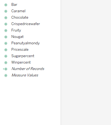
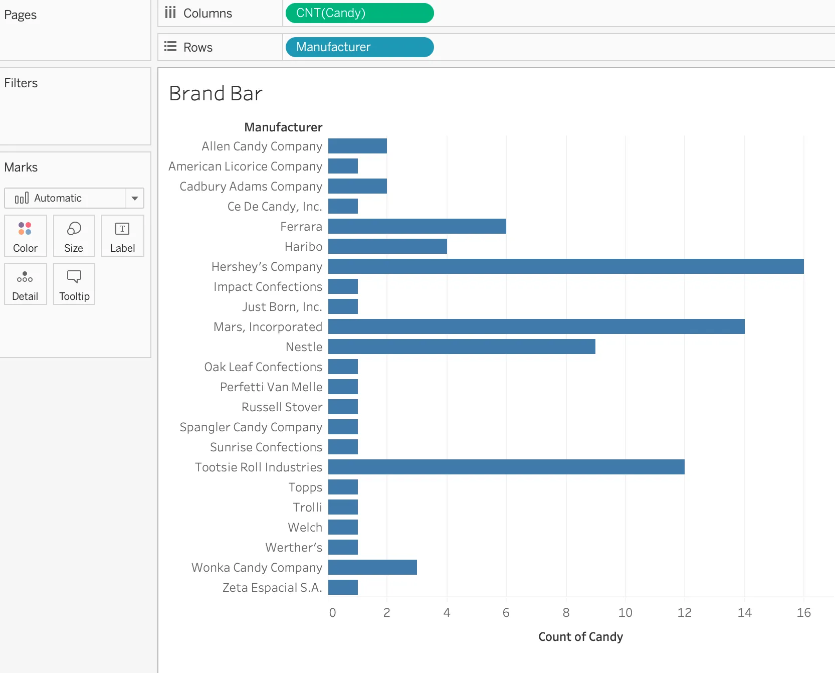
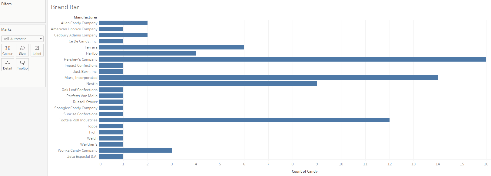
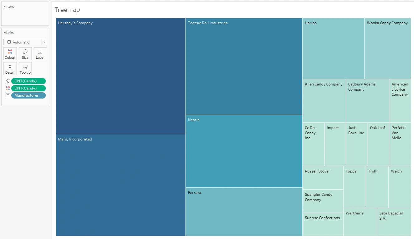
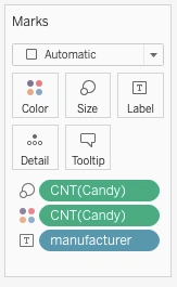
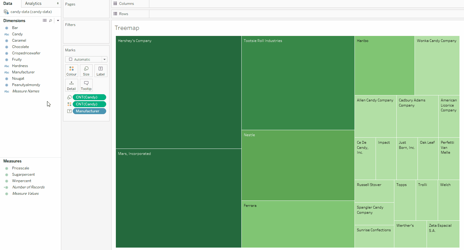
You’ll notice the columns you saw in Excel for Sheet 1 are set up as named variables in Tableau. Most of the variables in the set are identified as quantitative, or measures (i.e., variables that measure something, such as an amount or price) under the dividing line. In this case, the measures are also colored green, which means they’re continuous (their value could be an infinite number of things). Most measures are continuous, but in very rare cases, they can be discrete.
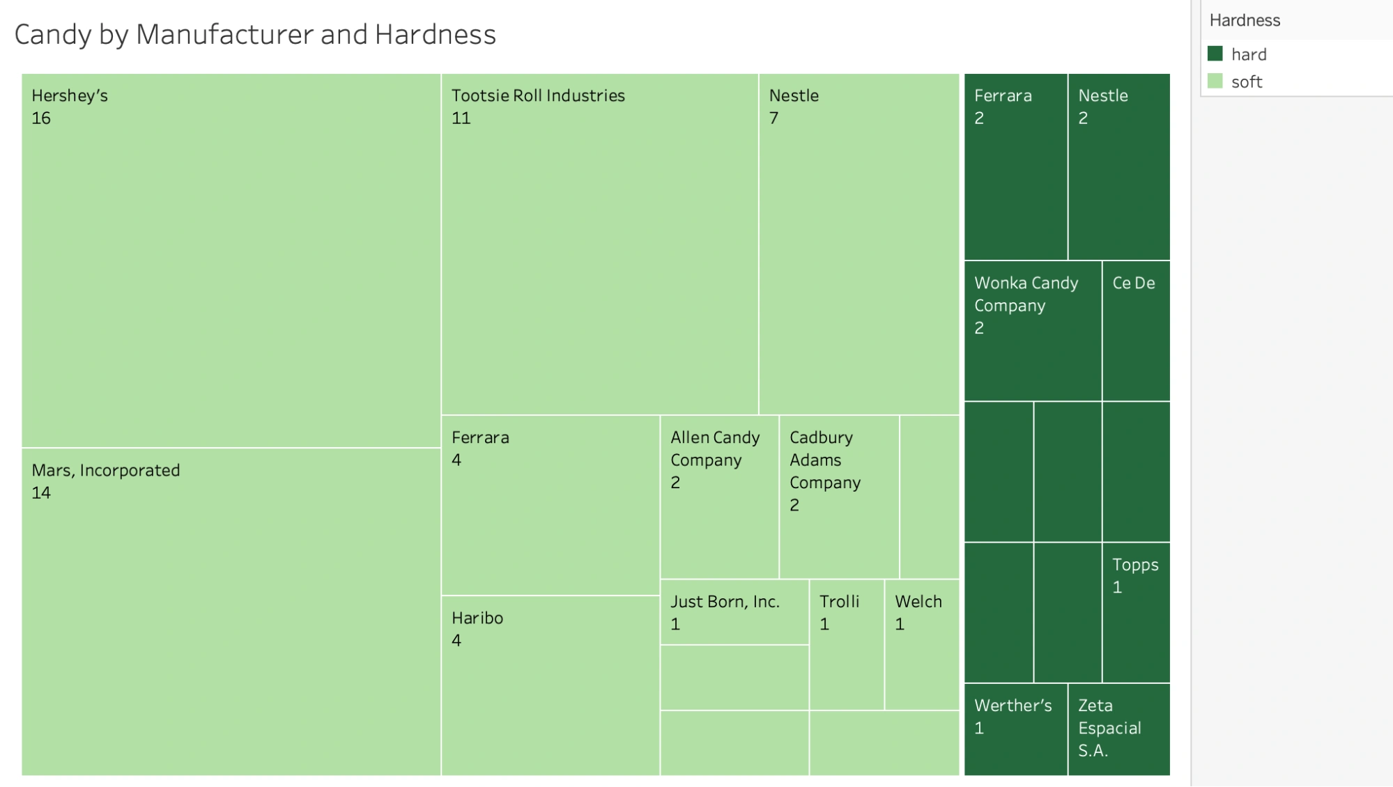
Some of the variables in the candy data set, however, aren’t correct, especially as you know from above that all of the 1s-and-0s columns are indicator variables. Just because the 1s and 0s are numbers doesn’t mean that they represent measures of something. They also can’t have values other than 1 and 0 and give you the same information. In this case, the 1s and 0s are indicating whether a candy contains, for instance, chocolate (1) or doesn’t contain chocolate (0). This is actually a very common scenario when working with data in Tableau, so you always need to check that your variables have been categorized correctly. You’ll fix these variables in a moment.
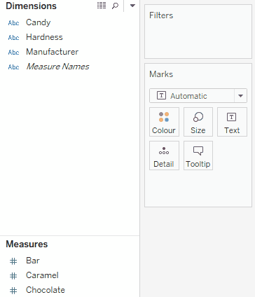
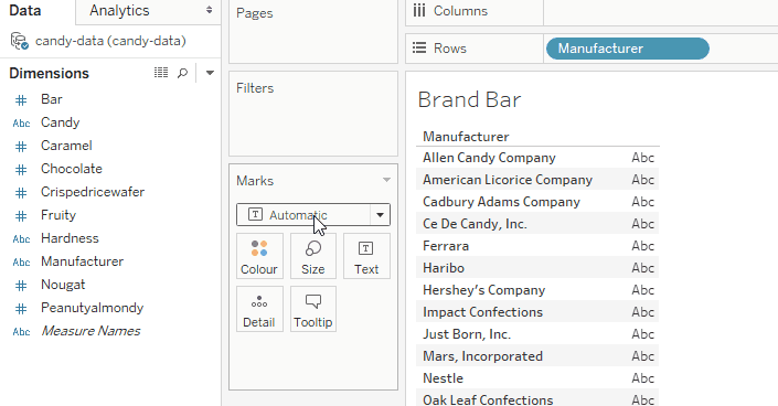
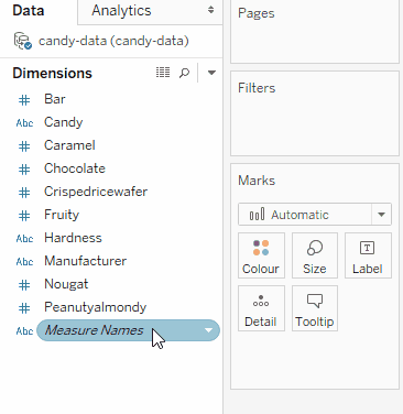
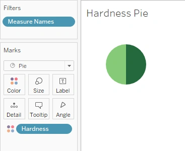
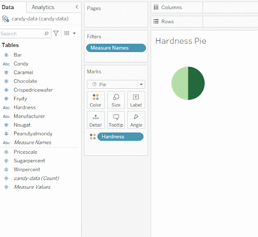
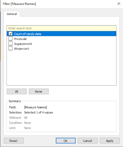
For now, look above the dividing line in the variable menu at the dimensions. Dimensions are qualitative, which means they might hold names, dates, or information about a category. The ones currently displayed are the candy name, the manufacturer name, the hardness level, and Measure Names (don’t worry about this one for now). The dimensions are all blue, which means they’re discrete values. Dimensions can be either discrete or continuous. By default, however, all the variables above the line in Tableau will be blue, and all the ones below the line will be green. You’ll see how to change this later on.
A good way to tell if a variable should be categorized as a measure or a dimension in Tableau is whether you can add them together. You can add things like amounts, prices, and weights, so these would all be measures in Tableau. Conversely, you couldn’t add “whether a candy contains chocolate” because it’s not an amount—it’s simply an indicator. You could, for instance, trade the 1s and 0s out for “yes” and “no” for the same result. These types of variables should, thusly, be categorized as dimensions.
Another type of commonly misidentified variable in Tableau is ID numbers. Many data sets have some sort of unique ID field, and this ID itself is usually a number:
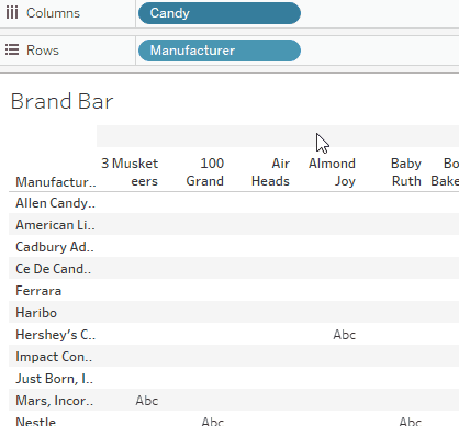
| competitorname | id |
|---|---|
| 3 Musketeers | 1000 |
| 100 Grand | 1001 |
| Air Heads | 1002 |
Just like with the 1s and 0s, you wouldn’t want to add these ID numbers—doing so would give you a brand new ID number that either has no meaning or is actually the ID number of a different candy! For instance, while you could add the 1000 ID number from 3 Musketeers to the 1001 ID number from 100 Grand to obtain an ID number of 2001, it would be meaningless to do so—that ID number might not even exist. As such, a numeric ID column should always be treated as a categorical variable—or, in the language of Tableau, a dimension.
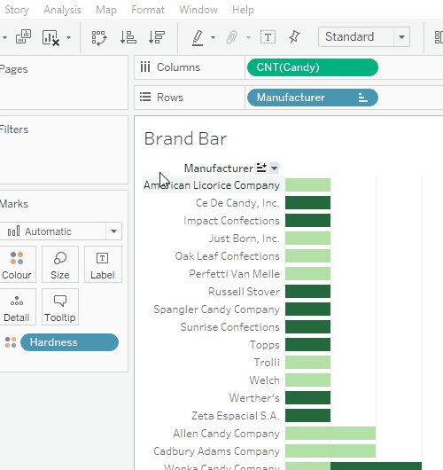
Now that you understand dimensions and measures, as well as continuous and discrete variables, let’s recategorize any variables that have been categorized incorrectly. All the candy characteristic flags (i.e., the 1s and 0s) should be categorized as dimensions. This includes the following variables:
- Bar
- Chocolate
- Caramel
- Crispedricewafer
- Fruity
- Nougat
- Peanutyalmondy
As you’re learning Tableau, you might find it helpful to look at the data in a more-familiar format. Feel free to keep the candy data set open in Excel and use it as a reference as you decide which variables to use and how.
You can move a variable between the Dimensions and Measures areas in Tableau by right-clicking the variable and selecting Convert to Dimension:
Or, clicking and dragging the variable to the Dimensions area:
Once you’ve recategorized all of the indicator variables as dimensions, your variables will be ready to use!
To sum things up, remember that measures are quantitative. Tableau will usually aggregate them when you use the variable unless you tell it not to. Dimensions, on the other hand, are qualitative. They’re best used to sort and order your data and define the data grain.
Tableau itself has a great page for understanding the differences if you want to do some bonus reading. Now that you have a general understanding of how they work, this page will act as a good reference.
With that, you’ve finished preparing your data in Tableau. This means you can move on to creating your first comparison charts: a bar and column chart.
3. Bar & Column Charts
Bar and column charts are so named because they display data as rectangular bars (or columns, depending on the orientation). Unlike pie charts, all the pieces don’t need to constitute a whole when added together.
The difference between a bar chart and a column chart comes down to orientation. A column is vertical, so column charts (left in Figure 11) are those with vertical pillars. Sometimes, you’ll hear them referred to as “vertical bar charts.” Conversely, bars are horizontal, so bar charts (right in Figure 11) are those with horizontal pillars. The choice between a bar or a column chart usually depends on the category names. On the left, the names are so long that they wrap onto a second line. This should be avoided when possible and can be easily mitigated by using a bar chart instead:
Having said all that, column charts tend to be referred to colloquially as “bar charts,” even when they’re oriented vertically. In fact, we’ll call them as such for the remainder of this Lesson. Don’t let this confuse you!
Humans can easily distinguish different lengths of a pillar (or bar). Thus, bar charts are good at displaying multiple categories of data; however, you can (and should) further help viewers by organizing the data in your bar charts, for instance, by arranging it in ascending (smallest to largest) or descending (largest to smallest) order. This relates to the grouping principle you learned about in Exercise 2.2: Visual Design Basics & Tableau. People like to see patterns, and size is one component that can be easily used to make patterns in data. For instance, in the graph on the left of Figure 12, you might unconsciously group bars B, F, G and J together because they’re all quite large. See how this has been done in the chart on the right of Figure 12, where bars B, F, G and J have been grouped together and all the bars have been ordered from smallest to largest:
Lastly, while it’s likely that every item in this data set can only be classified into one of the 12 groups, this isn’t actually a requirement for a bar chart. Sometimes, you may have data items classified into more than one group; for instance, if Figure 12 were a chart displaying which pets people owned, those who owned both a dog (group D) and a chinchilla (group C) could be counted in both of those groups.
4. Bar & Column Charts in Tableau
Let’s return now to your candy data set so you can walk through creating a bar chart in Tableau!
Make sure you’re on Sheet 1 in Tableau before moving forward. Before starting, it can be helpful to rename this sheet. Tableau has tabs similar to how Excel has sheets, which can get confusing if you have too many without descriptive names. If you double-click the name of the sheet you want to rename (in this case, Sheet 1), you can change the name to something more meaningful, like Brand Bar. This will make it easier to work with multiple tabs for different visualizations within the same file.
Now, let’s take a look at how you might go about creating a bar chart of the brands, or manufacturers, of each type of candy in your candy data set.
4.1. Bringing the Variables Into View
For this bar chart, you’ll be focusing on the brands, or manufacturers, of the different types of candy. As you might imagine, this means you’ll be using the Manufacturer variable as the grouping for your chart. Go ahead and drag the Manufacturer variable from the Dimensions area on the left-hand side of the screen to the Rows shelf in the visualization view:
Next, you want to bring the variable you want to count into the view. You’ll be counting the number of candies for each manufacturer, so you’ll want to drag the Candy variable over to the Columns shelf:
4.2. Specifying What You’re Counting
Tableau defaults to showing you the level of detail in your data so that each individual candy (or individual data row) is a new column. To make the bar chart, you want to count the number of candies in each category, and to do that, you’ll need to temporarily turn your Candy variable into a measure. Click on the down arrow to the right of the Candy variable, select Measure from the dropdown list, then choose Count:
You’ll notice that once clicking Count for the Candy variable, it will change from blue to green, indicating that it’s changed from discrete to continuous.
4.3. Selecting a Visualization
It’s time to choose your visualization type. You’ll notice that Tableau already defaulted to a bar chart, which in this case, is exactly what you need. If it hadn’t, you could have used the Show Me menu, which provides some handy hints about the type of data required for each chart type:
TIP!
The Show Me menu highlights what visualizations are available based on the data in the Rows and Columns shelves within your sheet. Tableau will tell you how many dimensions or measures each visualization requires. Some chart types require only dimensions or measures, like bar charts. Others require dimensions and measures, or even multiples of one or the other. This is why not all chart types are available for every data variable combination. The Show Me menu is a great way to see which charts require which types of data.
Now’s the time when you probably want to think about whether you want a horizontal bar chart or a vertical (column) chart. Remember that the main deciding point between the two is the length of your variable names—long names aren’t conducive to a column chart! If you take a look at some of the manufacturer names you’ll be working with, you’ll see that some can be quite long, so a horizontal bar chart is the safer way to go. If you did, however, ever want to switch between the two, you could simply click the Swap button, which is located above the columns shelf:
4.4. Checking Your Data
It’s always a good idea to visually check your final chart now and ensure that the type of chart is appropriate for the data. You know that you want to show counts rather than proportions (your numbers don’t add up to a whole), and you also know that you have quite a few manufacturers. Also, some of the manufacturers’ names are quite long. All three of these reasons make a horizontal bar chart the best choice for your data—and you can confirm this visually by looking at your chart:
Changing Chart Type
If you ever want to change the chart type of your visualization, simply click on the dropdown menu in the Marks card. You can also use the Show Me menu that you already learned about earlier!
4.5. Adjusting the Colors
If you want to change the color of your bars, you can click the Color box on the Marks card. From the color menu that drops down, you’ll be able to choose a new color for your bars. Note that for bar charts, you have to change the color of all the bars at once—you can’t choose colors for individual categories:
4.6. Adding More Variables
One additional functionality of bar charts is the ability to display two pieces of data on the same chart axis. By default, your first variable will be represented by size (i.e., the bar length), and your second variable will be represented by color. For example, you could show the count of candies by manufacturer and the hardness of those candies—the size of the column would represent the number of candies, while the color would represent the proportion of hard or soft candies. Go ahead and drag the Hardness variable from the left-hand list onto the Color box on the Marks card. The variable will then appear at the bottom of the Marks card with the color icon beside it:
You can adjust any of the aspects of the Marks card by clicking on the corresponding boxes above the list of variables. Let’s try adjusting the more detailed colors you’ve just created by clicking on the Color box. After clicking the Color box and selecting Edit Colors, the following menu will appear:
The bar chart shows two categories of candy (hard and soft), and neither has an intuitive color. Instead, why not create a monochromatic scale using a single color, green? Select green from the Color Palette dropdown list, then adjust the color of each category by first clicking on its name in the Select Data Item area, then selecting the color in the Select Color Palette area. In the example image below, we’ve chosen a dark green for “hard” and a light green for “soft” as it felt most intuitive.
4.7. Sorting the Data
As discussed above, it’s useful to organize your bar and column charts to make it easier for viewers to interpret the data. Let’s do that now by arranging the manufacturers in your chart according to candy count.
Start by choosing the variable you want to sort. In this example, you want to sort the Manufacturer variable according to candy count, so right-click Manufacturer in the Rows shelf, then select Sort. From the Sort menu, choose to sort by Field, then select a field name of Candy and an aggregation of Count (if these aren’t prepopulated already). This will sort your manufacturers according to candy count:
This organization makes it easy to see which manufacturers have more candies than others.
4.8. Adding Labels, Legends, and a Title
Remember that a visualization needs to be able to stand on its own. For this reason, you always want to add textual information such as labels, legends, and a title to your visualization. Let’s start by giving your chart a descriptive title. You can change the chart title by double-clicking the text above your chart and beneath the Columns and Rows shelves (in this case, “Brand Bar”), then editing the title text in the resulting model. A menu will appear, allowing you to type your new text, as well as choose the size, font, and color:
Let’s update the title to “Candy by Manufacturer and Hardness” to ensure you’re clearly describing what the visualization is communicating.
Next come labels and legends. With bar charts, labels and legends may or may not be necessary. For your candy chart, you’ll definitely need at least a color legend; otherwise, viewers won’t know what the two different colors of green are supposed to represent (hard/soft). Thankfully, Tableau usually creates these legends automatically, but if for whatever reason it doesn’t, you can add a legend by going to the Analysis menu and selecting Legends → Color Legend (Hardness):
As far as labels go, while the incremental axis text and vertical gray grid lines provide a lot of context for what the chart is communicating, you’ll still want to make sure you’re using descriptive axis labels to show what each axis is measuring. You can change the title of an axis in the same manner as the title—simply double-click Count of Candy at the bottom of your chart to bring up the Edit Axis modal:
Within this box, you can change things like the range, scale, and title of your axis. In this example, Count of Candy already works well as a descriptive label; however, if you did want to change the title to something more appropriate, you could do so under the Axis Titles section at the bottom of the modal.
You may also want to hide the rows label (Manufacturer) since it’s already clear what’s being shown on the y-axis. To hide the label, right-click the label text and select Hide Field Labels for Rows.
With that, you’ve finished creating your very first bar chart.
Let’s recap some of the highlights for creating bar and column charts:
- Column charts require short category names (labels), while bar charts can use long names (labels)
- Bar and column charts can show many categories or groups
- A data item can be counted in more than one category
- Charts should generally be sorted in ascending or descending order
- Colors can be used to add another dimension to the data
4.9. Stacked Bar/Column Charts
Before finishing up your exploration of bar and column charts, let’s take a quick look at one more option you have at your disposal—stacked bar/column charts. Similar to the way you used color in the bar chart you just made, stacked bar/column charts present another way of adding dimensions to your data. Let’s see how your bar chart might look as a stacked bar chart displaying manufacturer, candy count, and hardness:
Here, like before, the size of the stripes corresponds to the number of candy types each manufacturer produces. However, instead of each manufacturer having its own bar, they’ve all been layered within a single bar. The manufacturers are then color-coded, with an accompanying legend designating which color represents which manufacturer. Finally, two different bars have been used for hard candy (the bar on the left) and soft candy (the bar on the right). While all of this information was also available in the prior bar charts, this stacked version gives you a different manner of visualizing it.
You’ve probably noticed, however, that this chart is a bit difficult to interpret—there are simply too many categories and too many colors. This is one of the limitations of stacked bar charts. Similar to pie charts, when you have too many categories, it becomes impossible to read. For this reason, stacked bar charts are more common when looking at fewer categories with multiple time periods. Suppose your data set included how many candies were produced by each manufacturer from 2010 to 2014. You could have one bar for each year, then color-code the bars according to manufacturer. A chart like this would make it easy to see which manufacturers produced more and less candy across time:
To make a stacked bar chart in Tableau, follow the same steps as you would to create a bar chart, only choosing the Stacked Bars options in the Show Me menu instead. You can even change an existing bar chart to a stacked bar via this method!
5. Pie Charts
Pie charts are named as such because they’re circular and segmented into slices—just like a pie. All the slices together should constitute the whole pie, without anything extra. Pie charts are most useful for showing proportions or percentages of a whole (100%), and thanks to their simple nature, they’re easy to interpret by both data-savvy and non-data-savvy people alike.
Do note, however, that pie charts don’t work with all types of data. To work best, they need very few categories (slices) to make up the whole. If you have too many categories, it becomes hard to see which slice corresponds to which group, as well as how different each category is in terms of percentage of the whole. Take a look at the images below:
As a general rule, you shouldn’t use more than three categories within a pie chart. In addition, due to the circular shape of this type of chart, it can be difficult to distinguish very small differences between the sizes of each slice. Consider the example below that shows three categories of seemingly identical sizes:
Upon adding the data labels, it becomes clear that the categories actually aren’t identical and that “Group C” is the largest:
Though there are only three categories, their similar sizes make interpreting the pie chart difficult. In a case like this, you’d want to choose a different type of chart, such as a column or bar chart.
Another good thing to remember is that your visualization should always include enough information to tell the whole story about your data. If this pie chart were your only visualization, for example, you’d need to add a title and potentially more labels to ensure your audience is able to completely understand what information the visualization is trying to show.
5.1. Pie Charts in Tableau
Now that you know a bit more about pie charts in general, let’s take a look at how you can create a pie chart in Tableau! You’ll start by creating a pie chart visualizing candy hardness (one of the dimensions in your data set that you used for your bar chart). Candy is categorized as either “soft” or “hard.” With only two categories, this makes candy hardness a good contender for a pie chart. However, data isn’t always this cooperative. Sometimes, you’ll need to make an extra column or variable and aggregate your data to create a good pie chart element.
Start by making a new sheet for your visualization by clicking the new sheet icon at the bottom of the Tableau window. Go ahead and call this new sheet something meaningful, like Candy Hardness Pie Chart or Hardness Pie since you’ll be looking at hardness and using a pie chart.
5.2. Bringing the Variables into View
There are multiple ways to make a pie chart in Tableau, but you’re going to use the one that’s most applicable to many types of data. Sometimes, as an analyst, you’ll need to test several different ways to solve a problem! In this case, the first thing you need to do is change the automatic drop down under Marks to Pie. This means Tableau will treat anything you’re trying to create as a pie chart, which makes things much easier! This is like changing the type of chart under the Show Me button.
Next, drag the Measure Names variable into the Filter Box. This will add all of your Measures at once. Just press OK for now. Don’t worry that there’s too much data included! You can choose which data you want to use later.
Next, drag the data you want to compare into the Color box on the Marks card. In this scenario, this means the Hardness variable, as you want to compare how many candy options are of each hardness:
At this point, you’ll have an evenly divided pie chart. Not very useful! This happens because Tableau is showing you the level of detail (the data grain, as you’ll recall) of “Hardness.” It’s got two values, “hard” and “soft.” Note that it kept the color scheme you created for your bar chart! What you need to do is tell Tableau the values that go into the pie chart—in this case, how many candies there are. You’re going to change the data grain to “Candy.”
6. Specifying What You’re Counting
The pie chart is waiting to be filled with useful information, so let’s get to it! You want your pie chart to display the proportion of hard and soft candies within the entire set of candies. To create this, drag Measure Values from the bottom of your list of measures to the Size card:
You’ll notice CNT(candy-data) is one of the four entries. You’ve temporarily turned the Candy variable into a measure—something you can do math on—so that you can count the number of values. Tableau automatically shows you a count of each category when this happens:
6.1. Selecting a Value
You’ll notice you have a pie chart now, but it’s not quite right. Hover over the image, and you’ll see each of the measure values. All of them have been sorted by hardness!
There are two ways to fix this. First, you can click on SUM(Pricescale), SUM(Sugarpercent), and SUM(Winpercent) and press the delete key for each one. Second, remember that Filter box? If you right click on Measure Names and select Edit Filter, you’ll get to that same menu. Now, since you know what variable you want to show, simply uncheck the others and press OK. You should be left with just the total number of hard and soft candies!
6.2. Checking Your Data
At this point, it’s good practice to check whether your choice of chart does a good job of communicating your data. Take a look at the pie chart Tableau just created. Is it easy to interpret? Can you understand the information it’s trying to get across? Fortunately, the two categories in your chart are of vastly different sizes, which won’t present any issues for those trying to interpret it. This means that a pie chart is a good choice!
6.3. Adjusting the Labels
Next, you can go around adjusting the labels of the chart. You can add the percent distribution or category name – as you wish. Go ahead and play around with the different marks to polish your pie chart further.
7. Treemaps
The final composition chart you’ll be exploring in this Lesson is the treemap. Treemaps are similar to pie charts in that all pieces must constitute a whole. They’re used to show categories—and typically many categories—however, they’re a bit harder to interpret than pie charts or bar charts because of their more-complex nature.
Check out Figure 42, which demonstrates a typical tree map. The size of each box within the chart relates to the count of a single item. The larger the box, the more values there are in that category. Groups A, L, R, Z, and E, for instance, are the largest groups. Here, shading has also been used to supplement the size of the groups, so these boxes are also the darkest boxes in the chart:
Treemaps and bar charts are mostly interchangeable—it all comes down to a matter of preference. In fact, the above treemap could easily be made into a bar chart; however, too many categories can sometimes make a bar chart too large and hard to read. This is where treemaps really shine, as they’re most effective at presenting many categories within a small amount of space. Which chart do you think shows the data more effectively here?
7.1. Treemaps in Tableau
Let’s practice making a treemap! Head back to your candy data set in Tableau and create a new sheet called “Treemap.” The large number of manufacturers in your data set could make this an ideal variable to display as a treemap. Go ahead and begin moving your variables over as you did for your previous charts:
- Bring the variable that represents the grouping you want into the visualization view. In this case, that would be the Manufacturer variable because you want to examine how many candy options each manufacturer makes. Drag the Manufacturer variable to the Rows shelf.
- Bring the variable that you want to count into the visualization view. In this case, you’re counting the number of candies, so you can again drag the Candy variable over to the Columns shelf.
- For the treemap, you want to count the number of candies in each category. Just like before, this means you’ll need to temporarily turn Candy into a measure. To do so, right-click Candy, select Measure, and then choose Count.
- Finally, choose your visualization type. Use the Show Me menu to select Treemap from the dropdown list:
With that, your treemap is ready to go! Now to do some adjusting.
7.2. Checking Your Data
The difference in the size of each box according to count is what makes your treemap, well, a treemap! If you look at your new chart, for instance, you’ll see that the Hershey’s Company has the largest and darkest box. The Marks card shows that CNT(Candy) drives the size and color of the chart. This means that Hershey’s has the most candies. Following behind are Mars and Tootsie Roll Industries, which are both slightly smaller and lighter than the Hershey’s box:
As always, now is a good time to check that your choice of chart is the most appropriate for your data. While you could also create a bar chart from this data, the sheer number of manufacturers makes a treemap the better choice of the two.
7.3. Adjusting the Colors
Similar to the pie chart, when you counted the Candy variable, your variables moved from the Columns and Rows shelves to the Marks card. Here, you can see that the CNT(Candy) variable (the count of candy) determines the sizes and colors in the chart, while the Manufacturer variable determines the labels in the chart:
Let’s start with color! When it comes to treemaps, stepped color is most preferable. Stepped color is used to denote colors that change at discrete values rather than along a continuous scale. Using stepped color makes it easier to see and interpret each distinct category in a chart. Five categories of color (or steps) is usually a nice balance that allows for just enough color categories without overwhelming the viewer:
The above settings in Figure 48 would produce a treemap that looks like this:
Feel free to play around with the colors, testing out different steps to see how they affect the look of your treemap.
7.4. Adding More Variables
Treemaps are similar to bar and column charts in that you can display two pieces of data on the same chart. By default, the first variable is represented by the size of the boxes, while a second variable can be represented using color. In this example, you could show the count of candies each manufacturer makes and the hardness in your treemap, similar to what you did with your bar chart earlier. To do so, drag the Hardness variable onto the Color box on your Marks card:
7.5. Adding Labels, Legends, and a Title
Finally, let’s add some textual information to go along with your treemap. Treemaps, by nature, lack the axes and reference lines of the bar chart. Thus, you may want to add the count of candy to the labels as you did when creating your pie chart. To do so, copy the CNT(Candy) variable by holding down the Command key (Mac) or Control key (Windows) and dragging it onto the Label icon on your Marks card:
Now, let’s change the title of the chart to be more descriptive—something like “Candy by Manufacturer and Hardness” would work well. Also be sure that you’re displaying the color legend! Once you’ve applied all of these labels, your treemap should look something like this:
Compare this treemap to the first example. Where before, the bar chart may have shown clear trends, this treemap shows another dimension of data in a smaller area. You can see the number of candies by each manufacturer and whether the candy is hard or soft—all with only a single glance. What would you need to do to display this information in a bar chart?
To recap some of the highlights when creating treemaps:
- Treemaps work best with data in which all pieces must constitute a whole (similar to pie charts).
- Treemaps can display information with many categories in less space than bar charts.
- Colors can be used to add another dimension to the data that would be inefficient to show in a bar chart.
8. Publishing with Tableau Public
Before moving on to the Exercise for this Lesson, let’s take a quick look at how you can publish your work on Tableau Public. Tableau Public is more than a piece of software—it’s also an online gallery of all the visualizations that its users have created! When using Tableau Public, if you want to save your visualizations (which you likely do!), you need to publish them to the Tableau Public gallery. As a new analyst, this is an excellent way to create your first online presence and start building a portfolio of your work.
If you were using the paid Tableau Desktop software, which is what you’ll likely use once you begin working as a professional, you’ll be able to save your work to your local computer—a necessity given that you’ll often be working with private data! As you’re still learning however, and as you’re not using any private data, you don’t need to worry about this paid version yet and can simply focus on learning the craft.
In order to “save” (or “publish”) your visualizations in Tableau Public, open the File menu, then choose Save to Tableau Public:
You’ll be prompted to sign in or create an account (if you haven’t done so already), as well as name your visualization. You’ll then be directed to the online, published version of your visualization, which you can share with anyone by copying the URL. Pretty cool!
SAVING YOUR WORKBOOK
You’ll be using the visuals created in this Lesson from the candy data again in Lesson 9: Storytelling with Data Presentations, so be sure to save your Tableau workbook for this Lesson before moving on to the task.
Use a descriptive title to indicate that the workbook contains the sample project for this Lesson. With your workbook for this Lesson saved, you’ll be able to easily retrieve what you’ve done and continue working on it as needed later on in this Module.
Summary
Composition charts are just one of many visualization types, but they’re also some of the most commonly used, with both pie charts and bar charts falling into this category.
Composition charts are used to compare the amount (or size) of data across groups, and each type of composition chart is best suited to certain types of data. Pie charts, for instance, work well when looking at only a few categories and parts of a whole. Bar charts, on the other hand, work well when looking at many categories, as well as when categories are counts—not proportions or percentages. You can also turn them into stacked bar charts if you want to add another dimension to your data. Finally, treemaps are a great alternative to bar charts, working best when there are many categories to display. These charts are usually descriptive in nature, similar to the descriptive statistics.
Now that you’ve gotten a great introduction to composition charts (as well as how to create them in Tableau!), it’s time to try your hand at creating a few composition charts of your own—for your Cliqz project! To the task!
Exercise
Estimated Time to Complete: 1-3 Hours
For this Exercise, you’ll create some descriptive composition charts for the important variables you already identified in your data.
Hint: We recommend doing all the Exercises of Cliqz dataset in the same Tableau workbook. Name the worksheets appropriately, so that later on it’s easier to go back to the charts and combine them into a storyboard.
Directions
- Create a pie chart in Tableau using a categorical variable from your data set. You must decide what you’re counting.
- Hint: Think top 3 or 5… countries? queries? peak hours?
- Determine 1 reason why a pie chart would or wouldn’t be a good visualization choice.
- Use the visualization style guide you created in Lesson 2: Visual Design Basics & Tableau to design the visualization.
- Create a Word document with your answer to the question and a screenshot of your pie chart.
- Create a bar (or column/stacked) chart in Tableau using any of the variables as the category. You must decide what you’re counting.
- Use color to add another dimension to the chart.
- Use the visualization style guide you created in Lesson 2 to design the visualization.
- Add a screenshot of your bar chart to the Word document you created in step 1.
- Turn the bar chart you created in step 2 into a treemap.
- Use the visualization style guide you created in Lesson 2 to design the visualization.
- Add a screenshot of your treemap to the Word document you used in steps 1 and 2.
- Export your final Word document as a PDF and submit it in the drive for your mentor to review.
- Publish your workbook to Tableau Public in order to save your progress. Submit the link to your published workbook here along with your Word document.
Bonus Task
Find a composition chart online and explain what works well and what doesn’t work well in terms of how it communicates data. You can also use your visualization style guide to critique its visual presentation. Include your critique along with your submission for this task.
Submission Guidelines
Filename Format:
- YourName_Lesson3_CompositionCharts.docx
When you’re ready, submit your completed exercise to the designated folder in OneDrive. Drop your mentor a note about submission.
Important: Please scan your files for viruses before uploading.
Submission & Resubmission Guidelines
- Initial Submission Format: YourName_Lesson#_…
- Resubmission Format:
- YourName_Lesson#_…_v2
- YourName_Lesson#_…_v3
- Rubric Updates:
- Do not overwrite original evaluation entries
- Add updated responses in new “v2” or “v3” columns
- This allows mentors to track your improvement process
Evaluation Rubric
| Criteria | Exceeds Expectation | Meets Expectation | Needs Improvement | Incomplete / Off-Track |
| Composition Charts |
|
|
|
|
Got Feedback?
Contact
Talk to us
Have questions or feedback about Lumen? We’d love to hear from you.