Lesson 1 - Introduction to Data Visualization
Estimated Read Time: 1 Hour
Learning Goals
In this lesson, you will:
- Discuss the importance of data visualization for data analysts
In this Module, you’ll work on a search engine user behavior data, moving from a numeric statistical analysis to a visual analysis.
The dataset is inspired by a German product, Cliqz where the team strived to build a privacy-focussed search engine as an alternative to Google search.
Visual analysis is a common way to look at spatial variability (how data changes across space and geography).You’ll be able to use the visualizations you create not only as a means to analyze your data in more depth, but also as a way to better communicate the information you glean from it. Think of them as a way to supplement the descriptive statistical work, providing you with another option for sharing your analysis results with stakeholders. Different visualizations tell different stories and answer different questions, and you’ll explore the ins and outs of choosing the best options for your visualizations. Along the way, you’ll work towards answering the remainder of your analysis questions.
Ready to jump in? Then, let’s get started!
1. What is Data Visualization?
Simply put, data visualization is the representation of information in a pictorial format such as charts or diagrams. You may have heard the phrase “a picture’s worth a thousand words” before. Let’s consider the meaning behind it. Have you tried describing a picture before? And what about something more complex, such as a movie scene, set of dance choreography, workout routine, or even list of directions for making a sandwich? Putting this textual information into graphical form shortcuts a lot of the communication and language barriers we have as humans. In short, we’re wired to understand pictures and movement.

For hundreds of years, humans have used charts and diagrams to convey information, translating data across languages and cultures. Just as words make up sentences, phrases, and descriptions, pictures are often simplifications of more complicated data or analysis. These pictures are data visualizations. A data visualization is a picture using symbols to represent data, with the data itself potentially including numbers, dates, locations, or any manner of information. Visualizations of numeric data are often called charts, while visualizations of location data are often called maps. This variety of data is what makes data visualization such a varied and powerful field.
Consider the visualization below. This map shows all the Bigfoot sightings (the dots) in the state of Ohio in the U.S. compared to all the black bear sightings (the shading) in each county within Ohio (darker shades mean higher numbers of sightings). Using geography, the picture portrays a relationship between black bears and Bigfoot—Bigfoot sightings and black bear sightings tend to occur in the same counties, leading one to surmise that many “Bigfoot sightings” may actually be black bear sightings:
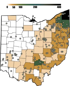
Imagine how you’d portray this same information without a visualization. A table would be tedious and, although it would contain the same data, the lack of a spatial visualization would make it difficult to concisely demonstrate how the variables relate to one another, making it harder to see that most Bigfoot sightings occur in the eastern part of the state, which is where, coincidentally, there’s also a high number of black bear sightings:
| County | Location | Black Bears | Bigfoot |
|---|---|---|---|
| Ashtabula | Northeast | 400 | 5 |
| Trumbell | Northeast | 300 | 4 |
Now that you can see both types of sightings—as well as the geography of the state—you might notice that the sightings not only coincide, but also occur in a specific pattern within the state. If you were to then go to a satellite view of the state in a mapping program, you might notice this eastern part of the state is the part that’s highly wooded. This makes it obvious why more sightings would occur there! It also provides a clue about where you could look for further data comparisons if you were looking at bear/bigfoot sightings in other areas. Visualizations can enable analysts to derive further insights from data that would be nearly impossible to spot by simply looking at a row of numbers or names!
2. A History of Data Visualization
Data visualization, though not always known by this term, has been around for centuries. From mapping trade routes on maps in ancient Babylon to the rise of charting and graphing in the 19th century, the data visualization techniques and methods we see today are grounded in a rich history of experimentation in the use of visuals to communicate complex information. Let’s take a look at a few different methods of data visualization and how they evolved throughout the years.
2.1. Mapping
Ancient civilizations in areas like Mesopotamia had an abundance of agriculture but lacked resources like timber and stone, so they relied heavily on trade. These trade routes were well traveled and of great importance to the societies who used them. Given that travel was such a vital component of ancient life, it isn’t surprising that maps were the first known method of data visualization. In fact, the oldest map in the world dates as far back as 6200 B.C. (the city of Babylon).
A map is a schematic representation of a physical landscape. Depending on the region mapped, it can include physical features such as cities and roads and geologic features such as hills and mountains. By laying out recognizable landmarks such as large boulders, forests, crossroads, and more, maps help people navigate the land and get to where they need to be. This made maps incredibly important to many ancient civilizations, especially considering the low literacy rates among the populations. Mesopotamian scribes, for instance, took up to 12 years to learn their writing system, and education was reserved for boys of wealthy families. As such, maps and diagrams were one of the only ways to convey information to the broader population. Those pictures were worth far more than a thousand words!
While few people today navigate by tree and boulder, maps in general are still used for navigating. Many drivers rely on GPS devices to offer directions. These GPS units provide written or verbal instructions and visual diagrams (or maps), making it easy to see the exact route you need to travel, no matter how complicated it may be.

One does have to wonder then—if written or verbal instructions can provide all the necessary details, why is the pictorial map still necessary? To answer this, consider a simple example using Google maps. Say you want to travel from the Computerspiele Museum to Strausberger Platz in Berlin, Germany. A text-based navigation for this route would require five distinct instructions including directions and street names:

In contrast, the pictorial version of the directions (i.e., the map) relays this same information with a single dotted line presented in conjunction with physical landmarks such as surrounding street names and businesses. The same information is presented in a more succinct fashion and—not coincidentally—one that many people prefer. Humans tend to be visually oriented, preferring pictures to text. The map version also makes the directions accessible regardless of the language you speak (unlike the written instructions), further demonstrating how visuals can be used to communicate across languages and cultures:

While much of the world today has higher literacy rates than in the olden days, maps have remained an excellent format for portraying directions and geographical landmarks throughout the centuries, as evidenced by their continued use even today.
But what came after maps? Let’s take a look at another way data visualization has evolved.
2.2. Coordinate System
In the 1600s, the next major innovations in data visualization began to take root. Rene Descartes, a 17th-century French mathematician, is best known for developing the foundation of the Cartesian coordinate system. The coordinate system is a means for displaying not only direction, but magnitude, as well. In one dimension, this is represented by a single line for charting numeric data:

In two dimensions, however, the coordinate system uses two perpendicular lines, commonly known as the x- and y-axes. The beauty of the two dimensional coordinate system lies in its ability to represent entire algebraic equations as lines, curves, parabolas, and circles:

This two-dimensional coordinate system is still used today as the underlying logic for many data visualization programs.
2.3. Proportional Representation
Another French mathematician, Charles Louis de Fourcroy, is credited with one of the next major data visualization innovations in the late 18th century. Interested in the growth of European cities, Charles created the Tableau Poléometrique (1782), which used squares to represent cities with the size of the square dictated by the area of the city. Organizing these squares from small to large caused cities with similar areas to be adjacent, making it possible to quickly and easily compare city sizes. While the concept of representing an object in proportion to its size may seem ordinary today, it was revolutionary at the time:

This chart is the first example of proportional representation. In proportional representation, the size of elements in a visualization correspond to their magnitude. By basing the size of each square on the area of the city it represented, the Tableau Poléometrique was the first known application of this concept.
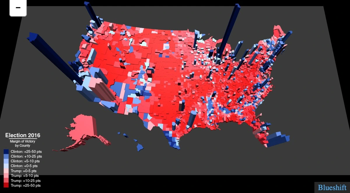
Proportional representation isn’t just limited to land size either. In the map of voters in the United States 2016 election in Figure 9 below, land size is represented two-dimensionally (like a normal map), while voters are represented three-dimensionally (taller three-dimensional bars corresponding to larger populations of voters within a district). This bridges the gap between land size and a secondary measurement, such as voters:
2.4. Charts
Next to enter the scene is William Playfair, a man of many aptitudes ranging from engineer to merchant to silversmith to economist. He recognized that charting could do more than display mathematical equations (as with the innovation in the Cartesian coordinate system)—it could also be used to demonstrate patterns. Some of the visualizations you’re familiar with today were initiated by his works, including line charts, bar charts, and pie charts.
He was one of the first to consider the role visualization charts could play in making information more widely accessible and understandable to a wider populace, as explained in his book Lineal Arithmetic (1798), where he stated:
“As the knowledge of mankind increases, and transactions multiply, it becomes more and more desirable to abbreviate and facilitate the modes of conveying information. Men of high rank, or active business, can only pay attention to outlines… It is hoped that, with the Assistance of these Charts, such information will be got without the fatigue and trouble of studying the particulars.”
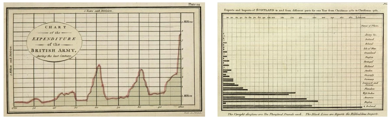
To demonstrate the power of these charts, he created a line chart visualizing the money the British army spent on a yearly basis, as well as a bar chart visualizing Scotland’s imports and exports. He published his economic data in The Commercial and Political Atlas in 1788:
William Playfair continued his graphing innovations in his 1801 publication The Statistical Breviary, where he created a pie chart visualizing the land holdings of the Turkish Empire. William Playfair was also the first to color-code his charts and use shading—a concept expanded on in the early 1800s in France. With his colorful personality, William Playfair was able to shift graphing from solely a mathematical application of the coordinate system to one in which data could be plotted to find patterns.
2.5. The Golden Age of Visualization (1800s)
The 1800s were a time of growing interest in data, during which people across many disciplines developed new, innovative ways to turn information into visual representations. Enter another French mathematician, Baron Pierre Charles Dupin, who helped move maps from diagrams of directions to statistical representations. In 1826, he published a map showing the spatial distribution of illiteracy in France, creating the first thematic map (i.e., a diagram visualizing a theme or concept—in this case, illiteracy—geographically). He additionally shaded the different geographic regions of the map to demonstrate the different illiteracy rates. This use of shading was another novel technique in and of itself, with his map becoming the first choropleth map (i.e., a map using shading to represent measurements of a certain variable) in existence:

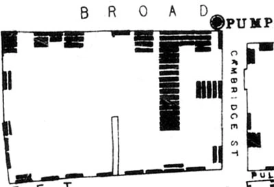
Another mapping innovation around this time was density mapping — the representation of each instance of an event by a symbol (e.g., a point or bar). In 1854, physician John Snow created a map of cholera deaths in the Soho district of London, with each death represented by a single dark line. Mapping each event at the street level of detail made it easy to see that the deaths were clustered around a single water pump source, which Snow was able to identify as the source of the epidemic and help stop its spread:
Density maps remain relevant today as a means of examining instances of events on a small geographic scale. They also provide a way to keep differing sizes of geographic regions from skewing rates. You’ll be exploring density maps in more detail later on in this Module.
Another notable individual in the data scene was Florence Nightingale. While most famous for her work as a nurse, she also contributed greatly to the developing field of statistics—a role that remains relatively unrecognized to this day. She made substantial innovations in the representation of statistical data while passionately advocating for the health of the British army during the Crimean War. Most famously, she created a color-coded version of a pie chart revealing that most deaths in the British army were actually due to preventable diseases (in blue) rather than wounds (in red) and that the Sanitary Commission dramatically decreased the death rate:
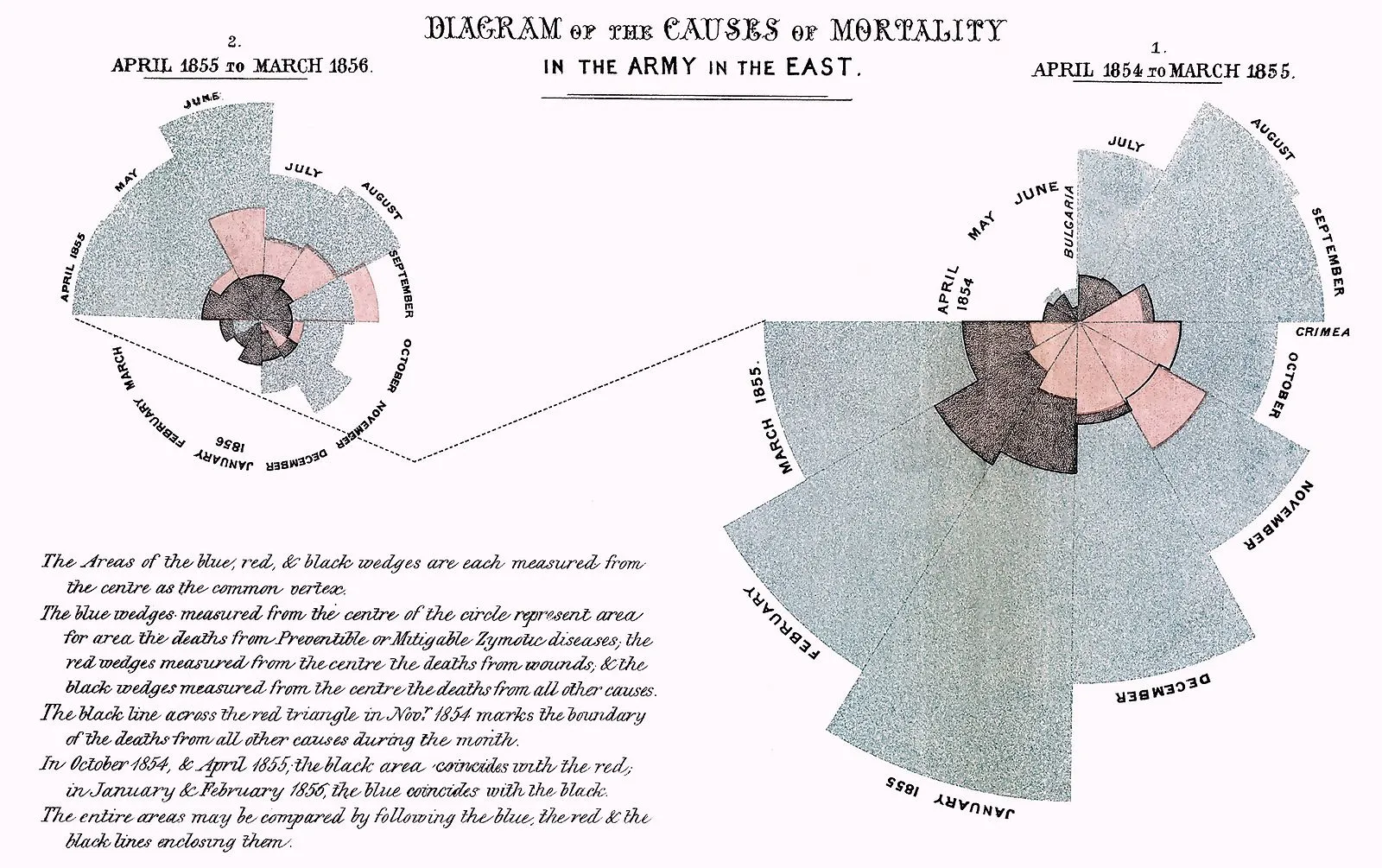
To this day, this pie chart is referred to as the polar area diagram, or the “Nightingale Rose.” At the time, these graphs provided a more-accessible way to communicate information to members of parliament to advocate for the health of the army.
2.6. Modern Day
While the 1800s were a time of invention, the 1900s were a time of simplification and refinement. This is the century that saw Harry Beck’s 1933 London subway map come to light, a simplified form of a large, complex map that was made less cluttered and easier to read. It was the first schematic representation of transit—and one that has since inspired subway system maps worldwide:
2.7. Data Visualization with Computers
As you can see, the foundations of data visualization were established long before the Information Age and widespread use of computers; however, with computers came a number of important changes; namely data interactivity and data visualization software. Let’s take a look at what both of these entail.
2.7.1. Visualization Software
There are a number of different tools available when it comes to creating your own data visualizations. For example, visualizations in Excel are easy to create and share, making it the go-to tool for many companies.
But there also exists software designed for the sole purpose of manipulating and visualizing data. The early 2000s saw an increase in these companies following a growth in the field of business intelligence (and a growth in the sheer quantity of data available to organizations!). Major players today include (but aren’t limited to) PowerBI (Microsoft), Tableau, Qlik, Cognos (IBM), and Domo. These tools offer more customization and functionality than Excel, but as they’re proprietary software, they require per-person licenses to use. Throughout this Module, you’ll be mastering Tableau, the industry-standard tool for data visualization. Tableau comes in both a paid and a free-to-use version. You’ll be using the free version in this course.
Finally come the open-source data visualization tools, of which the most popular are the data visualization packages offered in R (ggplot2) and Python (matplotlib, seaborn). Like the data software mentioned above, these tools offer more customization than Excel, and as they’re not proprietary, they don’t require licenses to use. They do, however, require familiarity with code, making them more difficult to use (and limiting their accessibility to those who know R or Python). As part of the complete Data Analytics program, fortunately, you’ll be learning Python, so you’ll get to see exactly what it means to create compelling visuals and dashboards using nothing but code!
2.7.2. Interactivity
In addition to making data visualization more widespread, the adoption of data visualization software has brought a new sense of interactivity to data. In a static graph, the data is set, and the person viewing the graph can’t make any changes to it. Consider this simple line chart showing the count of something across many years. In its current form as a static visualization, nothing about it can be changed:
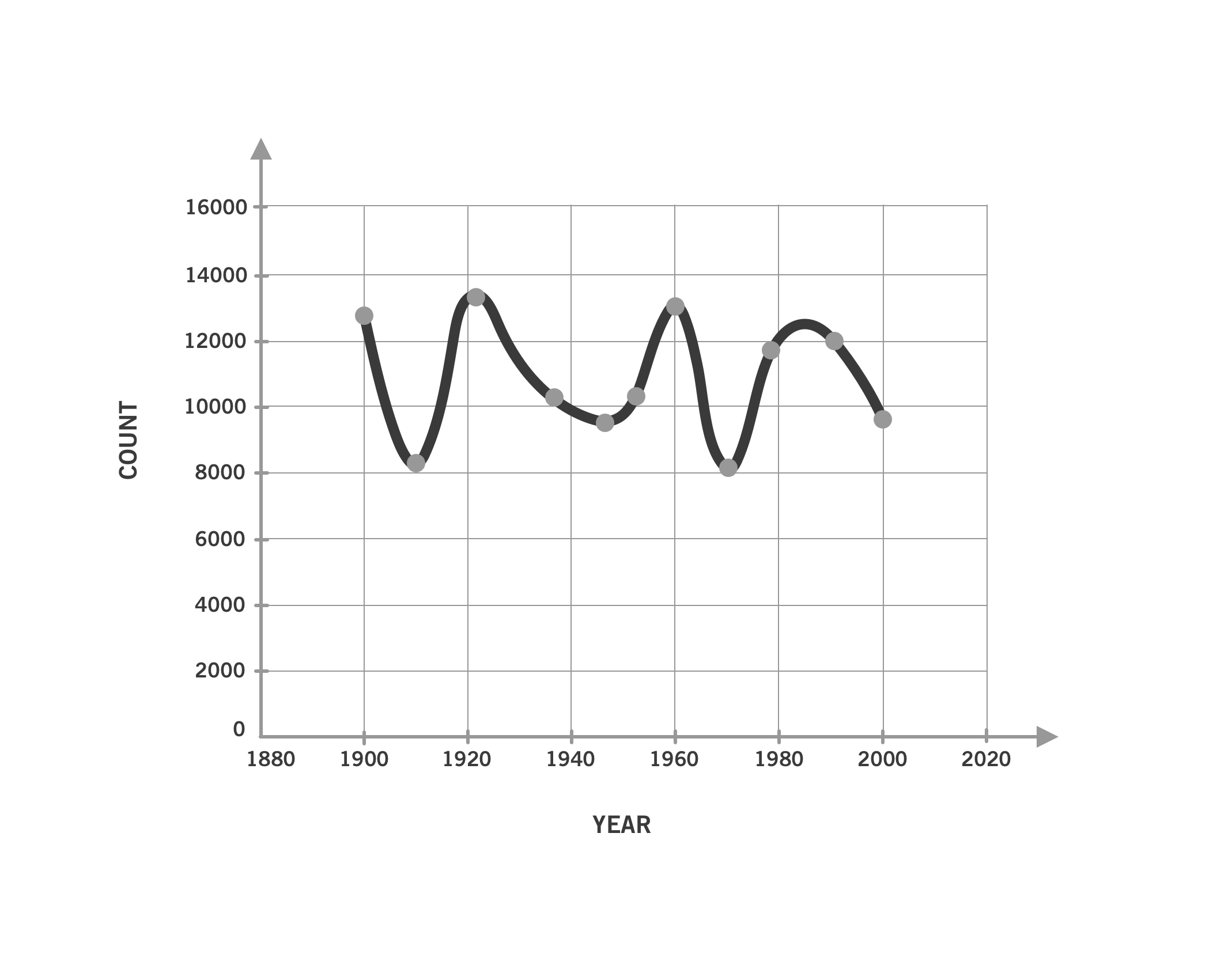
What if you wanted to look at the count broken down by intervals of five years—or single years—instead of every ten years? You’d need to ask the author of the chart to create new versions of the chart using each of these different intervals.
Interactivity is the opposite of static. If this chart were interactive, the time interval could be adjusted instantly, allowing the user to look at the data in 10-year, 5-year, and 1-year intervals (or whatever interval they want!) by simply pressing a button or entering a number. In this manner, interactivity makes data accessible to end users (not just data analysts) and allows them to ask and answer questions without requiring additional data or work by the analysts. Interactivity like this can be achieved by way of data visualization software like Tableau or programming languages like Python. The end result usually takes the form of an online visualization that can be shared and interacted with by end users (unlike, say, a static PowerPoint or PDF).
As an analyst, interactivity also makes your job a lot easier. You can easily bring in new data or change the axis scale without creating a whole new visual. This is especially convenient when your stakeholders have additional questions regarding the data or want to see the data presented in different ways. The self-service format of interactive visualizations allows users to answer some of their own follow-up questions without the need to ask the analyst for updated visuals.
Whew! That was quite the trip across time! But now you should have a much clearer picture of not only how the field of data visualization has evolved, but also how important the field has been to so many people throughout the years. With the history lesson out of the way, let’s wrap up this lesson by consolidating some of data visualization’s key functions and use cases.
3. The Power & Purpose of Visualization
So far in this lesson, you’ve explored how visualization methods and applications have developed over time. No matter the point in history, however, visualizations have always been created with one thing in mind: communicating insights. Let’s dig further into this by taking a look at the three primary areas in which visualizations are used: 1) as part of an analysis, 2) as communication aids, and 3) as conduits for new perspectives on existing problems.
3.1. Visualization as Part of Analysis
Probably one of the most pertinent questions for you as an analyst is how visualizations can help you during your analysis. Oftentimes, simply looking at your statistics won’t tell you how your data behaves. In these cases, visualizations can be used to help you better understand your data and develop your own insights, making them, themselves, another analytical tool to add to your toolbelt.
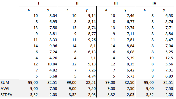
The importance of data visualization as an additional tool for data analysts is best demonstrated by Ancombe’s Quartet (1973). Francis Anscombe, a statistician, created four data sets of eleven pairs (x,y) of numbers. Each data set resulted in the same descriptive statistics — in other words, they all had the same sums, means, variances, standard deviations, and correlation coefficients. As such, if you were only going by your summary statistics, each data set would appear to be the same:
The graphs, however, were extremely different:
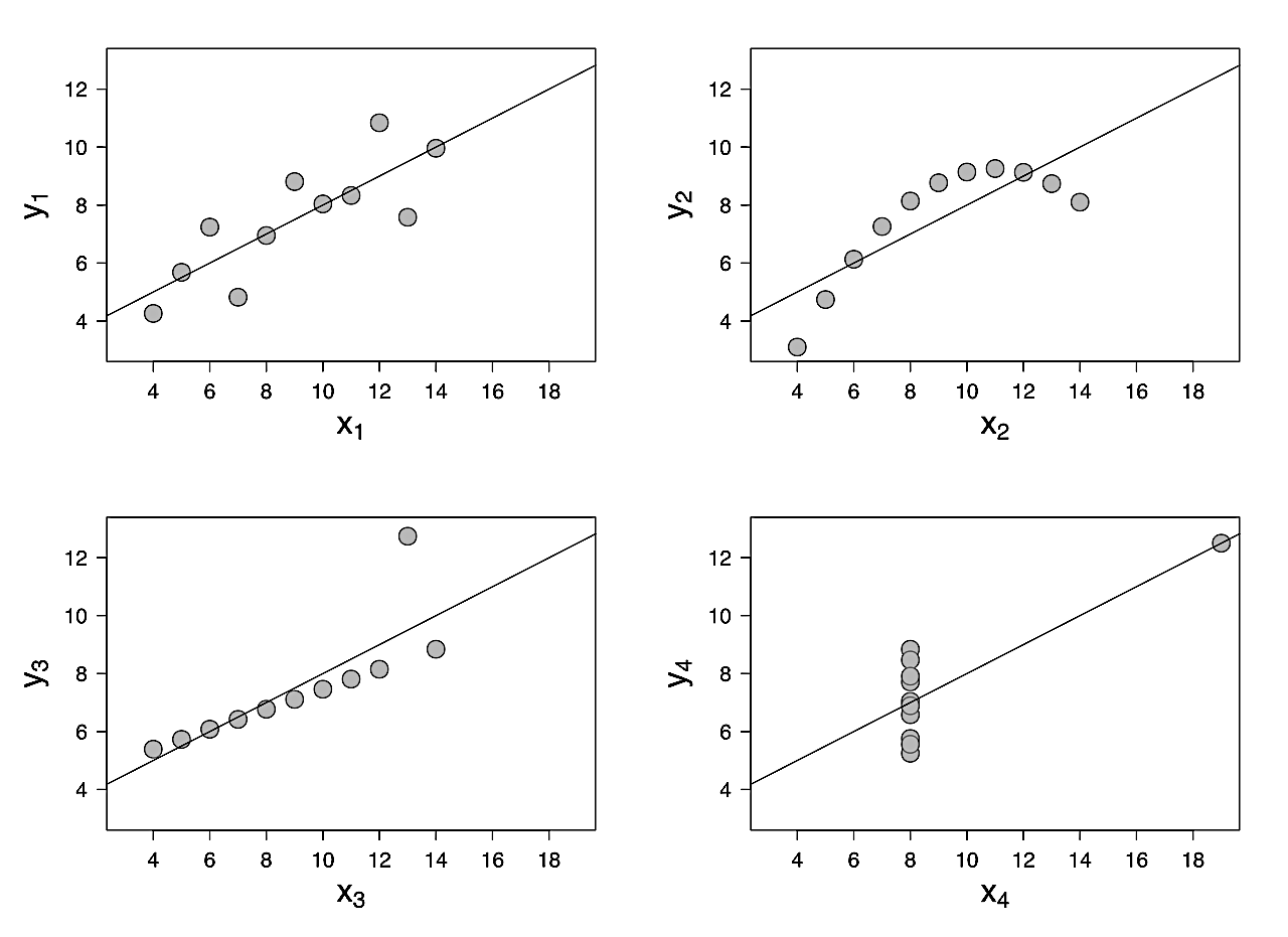
As you can see from the graphs, the first data set clusters somewhat evenly around the line of best fit (the line), the second data set follows a curve, the third data set forms a diagonal line with one outlier, and the last data set forms a vertical line with one extreme outlier. While all four data sets result in the same descriptive statistics, they look very different when represented visually. By presenting these graphs, Anscombe proved how important data visualization can be to describing and understanding data, especially as a way to identify trends (linear, curved) that may be unclear in table format.
This is just one example of how useful data visualization can be in understanding data and seeing patterns or trends during an analysis. As such, it’s a logical addition to the data profiles — and a core component of exploratory data analysis.
3.2. Visualization for Communication with Others
Data visualization can also be used as a means to communicate with others about your data and analysis. In fact, this is the core function behind data visualization!
It takes a certain level of expertise to be able to dive into spreadsheets and tables of numbers, and not everyone has the tools to evaluate data in an analytical way. Information in a diagram or chart is much easier to consume than information in a table. Additionally, the data visualization itself can give clues about the data. For instance, you wouldn’t use a map to represent your data if it didn’t include a geographic component. In this manner, the type of visual itself can inform viewers as to the type of data it displays.
For this reason, data visualization can democratize data and complex topics, trends, and insights. Oftentimes, the analyst takes the role of the middle-person between high-level stakeholders and a specific domain within the organization, and visualizations play a significant role in communicating between these two groups.
No matter the type of analysis project you’re working on, there will always be some manner of communication required. After all, every project has multiple stakeholders, and those stakeholders need to be kept abreast of the project’s progress!
3.3. Visualization for New Perspectives
Not only are graphs a means to present data in a visual manner, they’re also a means to prompt different ways of thinking about data. You’ll start looking at how you can create compelling visuals in the next lesson, but for now, simply know that how something is visualized can prompt new understanding of existing or known issues. You already saw how Nightingale’s visualizations were a way of challenging the notion that British army deaths were being caused by wounds in the Crimean War, which lead to increased support for better sanitary conditions.
Another excellent example of how data visualization can be used to foster new perspectives is the work of W.E.B. Du Bois, an American writer, historian, and civil rights activist. Du Bois used data visualizations to quash numerous stereotypes about African Americans in the United States in the late 1800s and early 1900s after recognizing that raw data alone wouldn’t be convincing enough to change attitudes toward and the treatment of African Americans. As a result, he developed a collection of simple yet compelling visualizations for “The Exhibit of American Negroes” in Paris in 1900. The visualizations were used to compare data on African Americans in the U.S. with data for white Americans and Europeans, as well as demonstrate certain rates of change over time—for example, illiteracy and, as below, the number of free people vs. slaves:

Du Bois’s visualizations helped him prove that certain prejudices and stereotypes against African Americans were unfounded. While the impact of these visualizations remains largely unknown given the lack of inclusivity within the field at the time, they’re still a great example of how visuals can be used to foster new perspectives on existing thoughts and beliefs.
Another great example of visualizations being used in this way comes from Hans Rosling, a Swedish physician and statistician, and his daughter-in-law, Anna. Rosling came up with new ways to visualize health data from the United Nations, challenging people’s outdated perceptions about other countries—for instance, about child mortality rates and “developing” countries. He was motivated by the idea that scientists and world leaders wanted to do good but couldn’t solve problems if they didn’t understand the world.
Hans Rosling was a prolific TEDx Talk speaker, and his work is best demonstrated by watching one of his talks (linked in the Resources section below). His work was so influential that in 2012 Time magazine named him one of the 100 most influential people in the world. Much of this fame came not from collecting new data but, rather, visualizing existing data in novel ways that challenged people’s perceptions. While his data visualizations themselves were nothing beyond the scope of what you’ll easily be able to create by the end of this Module, it was the way he compiled and presented the data in new, thought-provoking ways that truly demonstrated his ingenuity:

Above, you’ll see two of his famous bubble charts demonstrating changing demographics. The size of the circle represents the population of the country, and the color corresponds to the continent. In 1960, the bottom-right cluster includes mainly western “developed” countries (i.e., United States, UK, Germany, etc). These countries had small family sizes (few children per woman) and high child survival rates (low infant mortality). Many people today continue to view the world in this 1960s lens, thinking that only these select western, or “developed,” countries have small family sizes and high child survival rates.
People fail to realize that over the last 50 years, many countries have moved out of this “developing” status. Improvements in hygiene, education, and access to penicillin have led to higher childhood survival rates in countries like India, China, Turkey, and Egypt. Rosling animated this data to show how the countries have changed throughout the years. The 2007 graph shows how many countries have joined the western world when it comes to smaller families and higher child survival. In this regard, the distinction between developed and developing countries disappears—a fact that this data visualization clearly demonstrates.
There are so many ways in which data visualization creates new opportunities for communication. It can highlight patterns or trends, act as a mechanism for sharing insights, and even engender new perspectives on known issues. You’ll be exploring how different visuals can serve each of these purposes throughout the lessons in this Module.
Summary
This Lesson gave you a thorough introduction to the history, evolution, and purposes of data visualization. You explored how compelling, well-crafted visualizations can reach a variety of new audiences, as well as bring to light insights not easily gleaned from tables of raw data or summary statistics. To put things mildly, data visualization is a big deal! And you’ll be learning all of its secrets in the Lessons to come!
In the next Lesson, you’ll begin exploring your first data visualization software — Tableau — and learn tricks for designing visualizations that are effective, compelling, and accessible.
Suggested Readings & References
Exercise
Estimated Time to Complete: 1-2 Hours
In this Module, you will work on a search engine dataset by Cliqz. Cliqz was a privacy-oriented web browser and search engine developed by Cliqz GmbH.
Cliqz GmbH was founded in 2008 with the vision of an open internet where people have control over their data and are not spied on and manipulated for economic interests.
In 2021, Cliqz search technology (now known as Tailcat) and its team of developers became part of the US company Brave Software.
Read this article to understand the motivation and vision behind Cliqz: The world needs Cliqz. The world needs more search engines.
(Optionally) If you want to understand more about how to build a search engine from scratch check out this official blog.
In this dataset, we will look at the user’s online search behaviour related to queries typed and URLs clicked. Download the cliqz search dataset here.
Task 1 : Exploring Ciqz Dataset and generating business questions
- Explore the query-url-data.xls and make sure you understand the different parameters. The countrycode and timestamp may seem unusual. Please make sure you understand them.
- Hint1: Read more about the numeric country codes.
- Hint2: Read more about Unix Timestamp.
Prepare the business questions that this dataset can answer. Write them in a doc or ppt.
Task 2: Data Preparation: Country codes and timestamps
- Add the country codes to the dataset using the country codes provided in country-codes.xls. You may use xlookup as explained in Lumen Data Analytics Fundamentals course.
-
- You should have ultimately three columns representing country code. The original code with numbers (e.g. 276), the 2-character ISO code (e.g. DE) and the country name (Germany)
- Convert timestamp to human readable form.
-
- Add two new columns. Name first as date and the other as time.
- Enter the Formula: In an empty cell in Excel, type the formula: =[timestamp]/86400+DATE(1970,1,1)
- You’ll see a number, Click the cell and select Format cell. Then format as “Date” for the first column and “Time” for the second. You should see the date and time in the respective cells.
- Extend the formula to the rest of the dataset.
Task 3: Install Tableau
Download and install Tableau Public so you’re ready for the next Lesson. You can download the software by entering your email on the Tableau Public homepage.
Submission Guidelines
Submit your solution as a document and an Excel with prepared data.
Filename Format:
- YourName_Lesson1_Overview.docx
- cliqz-search-data-prepared.xlsx
When you’re ready, submit your completed exercise to the designated folder in OneDrive. Drop your mentor a note about submission.
Important: Please scan your files for viruses before uploading.
Submission & Resubmission Guidelines
- Initial Submission Format: YourName_Lesson1_…
- Resubmission Format:
- YourName_Lesson1_…_v2
- YourName_Lesson1_…_v3
- Rubric Updates:
- Do not overwrite original evaluation entries
- Add updated responses in new “v2” or “v3” columns
- This allows mentors to track your improvement process
Evaluation Rubric
| Criteria | Meets Expectation | Needs Improvement | Incomplete / Off-Track |
| Understand Cliqz and Formulate Business Questions |
|
|
|
| Data Preparation |
|
|
|
Got Feedback?
Contact
Talk to us
Have questions or feedback about Lumen? We’d love to hear from you.