Lesson 2 - Visual Design Basics & Tableau
Estimated Read Time: 1 Hour
Learning Goals
In this lesson, you will:
- Define styling and visual design principles for effective visualizations
- Open and connect to data using data visualization software (Tableau)
The previous Exercise walked you through the expansive history of maps, charts, and graphs and how they’ve evolved over time, before touching on the importance of data visualization as a means of analyzing and communicating data. The remainder of this Achievement will focus on the creation of those visualizations—from choosing the best type of chart for the data at hand, to navigating your way around visualization tools, to ensuring your visualizations are as effective as possible. Much of that effectiveness comes down to basic graphic design principles; for instance, use of color, size, and layout. You’ll be exploring all of this in detail as you practice making some visualizations of your own for the data analysis project.
Ready to get started? Then let’s kick things off by taking a look at what makes visualization effective together with some examples of good data visualization in practice.
1. Elements of Good Data Visualization
Charles Minard created a map of Napoleon’s 1812 Russian campaign that’s still viewed today as one of the premier examples of data visualization. Before digging into the whats and whys of this visualization, let’s take a slight detour to discuss the history behind this visualization to better understand its purpose. In 1812, Napoleon moved his army of some four hundred thousand soldiers northeast from Poland in hopes of eventually conquering Russia. The Russian army, subsequently, retreated back into Russia, burning the land behind them in order to starve Napoleon’s armies of supplies. As temperatures dropped, Napoleon was forced to retreat to avoid the hardships of the Russian winter, and the campaign ended a complete disaster—thousands of soldiers lost as a result of starvation and freezing temperatures.
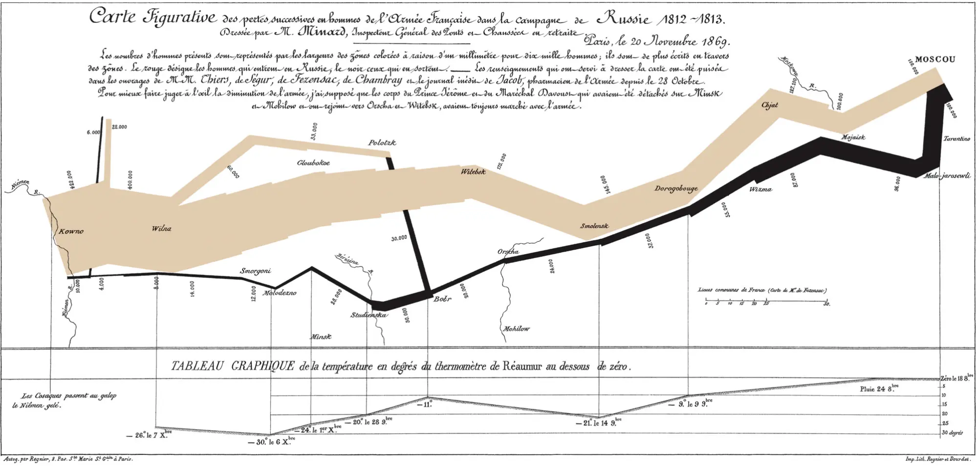
While the original visualization is annotated in French, there’s a translated, interactive version in English you can access, as well. We recommend that you keep a copy open in your browser for reference throughout this Lesson.
The large tan line in the middle of the map represents the size of Napoleon’s army. It begins on the left-hand side of the map — the Polish-Russian border — where it’s the largest at 422 thousand soldiers (1 millimeter of thickness corresponds to 10,000 men). This line continues to the right, following the path of the army and annotated with the names of geographic landmarks such as the cities of Kowno, Wilna, Smorgoni, Gloubokoe, and Polotzk. Some of these serve as reference points while some, such as Polotzk and Smolensk, designate significant battles. The line also shows places where the army splits in an effort to protect Napoleon’s flank.
After reaching Moscow, Napoleon’s troops retreated to avoid the Russian winter; however, temperatures were already below freezing, leading to the death of many more soldiers. This retreat is represented by the black line along the bottom. Here, once again, the thickness designates the location and size of the army. Included, as well, is a temperature-and-time graph along the bottom of the page, which allows you to see that when the retreat began in Moscow on October 18, temperatures were already at the freezing point. Of particular note is the decrease in troop size at the Bérézina River, where Russians blocked the route and Napoleon was forced to improvise. Many soldiers died here, while others were simply abandoned as Napoleon burned bridges to prevent Russian pursuit.
Altogether, this visualization displays geography (the movement of troops with textual annotations), time (the graph along the bottom), temperature (also the graph along the bottom), direction (the army’s route), and army size (the size of the lines), and it does so without the use of a traditional map, rather, different colors, sizes, and annotations. You can see now how it was quite innovative in its solutions to communicating different information!
1.1. Simplicity
Charles Minard’s visualization makes excellent use of a core graphic design concept — simplicity. Simplicity refers to the transmission of information using the least possible amount of textual or graphical accompaniment. In other words, minimizing the design. Simplicity is the core principle when it comes to creating effective data visualizations, and it’s one of the hallmarks of a good data analyst.
In creating his visualization of Napoleon’s campaign, Minard didn’t produce a map of Russia. Instead, he added annotations for a few key Russian cities along with a scale bar (the legend comparing the distance on paper to its corresponding distance in Russia). This was enough to convey the geographic location and movement of Napoleon’s army — and an example of simplicity at its finest. Rather than bog viewers down with a complete Russian map, which would have contained far more information than necessary, he pared the visualization down to only the essentials: the cities involved in Napoleon’s campaign.
Consider the following visualization based on data from employers offering H-1B visas (visas that allow for temporary employment of foreign workers in the United States). Each employer is represented by a circle, and the size of the circle is determined by the number of employees with H-1B visas; however, there are far too many employers to actually read, and the text itself isn’t even that readable. Additionally, while the employers appear to be categorized into different groups (e.g., Amazon and Microsoft are included within the larger circle), how these groups have been determined is unclear:

On the surface, this visualization seems relatively simple — it uses a very limited color scheme and only employs text and circles to visualize the data. As soon as you try to use it, however, you realize it’s actually quite complex, and the simplistic aspects of it are actually hindering comprehension. For instance, there are too many different categories, none of which are annotated. In addition, the sheer quantity of circles and ranges in circle size add to the confusion, which limits a viewer’s ability to compare the different data points. For the information it’s trying to communicate, it simply doesn’t serve its purpose.
To improve this visualization, you could try limiting each group to the top five or ten employers in each category. The groups themselves should also be labeled and the range in scale made more obvious. You might also consider splitting up this information into multiple visualizations better suited for the type of data they’re trying to communicate.
Simplicity is one of the hardest aspects for an analyst to realize. You’ll often find yourself wanting to convey as much information as possible; however, without simplicity, your stakeholders will have a hard time understanding and acting on that information. Visualizations need to be understandable so that users, whether you as the analyst or the stakeholders you’re trying to communicate with, don’t misinterpret the information.
1.2. Text
Almost all visualizations contain some sort of textual element, usually to explain the purpose of things not inherently clear at first glance, such as symbols, shapes, and colors. The golden rule of data visualization is that a visualization should be able to stand on its own, and it’s the textual elements that play a large part in making this possible—either in the form of labels or legends.
1.2.1. Labels
Labels are textual explanations that add information to a visualization. One of the most obvious examples of labels are titles and axis descriptions that, for instance, designate the units and scale. Minard labels the temperature graph axis on his visualization of Napoleon’s Russian campaign with a range of temperatures from 0 to -30 degrees, providing both the scale and unit. The diagram itself also includes a descriptive title, giving viewers the information they need to understand what the visual is depicting.
In the H-1B visa visualization in Figure 2, you saw the effect that a lack of labels can have on a visual. Despite the abundance of text it employed, there was still no way to decipher how the employers had been grouped, effectively rendering that entire aspect of the visualization moot. To decipher this visualization, you need additional information about what it represents, which breaks the golden rule of visualization—that they should exist as standalone resources.
Having said that, this doesn’t mean you should simply start adding a bunch of text to your visualization. Text should always be added thoughtfully and sparingly so as not to add clutter. Minard’s map, for instance, doesn’t label every Russian city, rather, just enough to provide location context or to signify significant events.
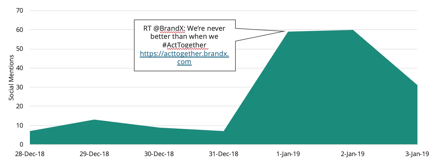
Using Callouts
Callouts are detailed labels that provide context behind any significant changes the data in your visualization may display. In a chart displaying monthly sales of a product, for instance, you might have a callout explaining a particular peak or trough in monthly sales. Check out Figure 3, below, where you’ll see that a callout has been used to explain a peak in how many times BrandX was mentioned across social media. In this case, a BrandX tweet was shared on Twitter, which led to an increase in daily social mentions:
1.2.2. Legends
When using colors, size, or symbols in a visualization to communicate information, you should always add a legend. A legend is a small reference included on many visualizations — particularly maps — that explains what each feature of the visualization signifies. If you made use of a color scheme, for example, the legend would explain what each color represents. Or, if you were using graphics of different sizes to denote scale, you could use a legend to describe what the different sizes correspond to. Most commonly, legends have been used in maps to indicate what landmarks the various symbols represent:
This is the one component missing in Minard’s map: one can only infer that the tan line represents advancing troops while the black line represents retreating troops. Similarly, on the H-1B visa visualization, there’s no legend indicating what the size of each circle corresponds to in terms of quantity.
Do note, however, that you should never use so much text that you overwhelm viewers. Let’s take a look at another example. Consider this map of workers earning minimum wage or less in the United States:

The map in Figure 5 very clearly conveys the percentage of the population earning minimum wage or less by state. The map itself shows each state along with labels in the form of state abbreviations. It color-codes the states into categories based on the percentage of the population receiving minimum wage or less, while also including the exact percentage as additional labels.
These additional labels are redundant because the color scale already conveys enough information to understand the map. In trying to be too precise, the map designer has sacrificed simplicity. A more appropriate map would remove the percentage labels while keeping the color scale, state labels, and legend. Ideally, the title or color legend would include more information about the data behind the percentages—for instance, the title could be “Percentage of Working-Age Adults Making Minimum Wage or Less” or “Percentage of Hourly Workers Making Minimum Wage or Less in the U.S. in 2017” (as per the source description at the bottom of the visual).
1.3. Space
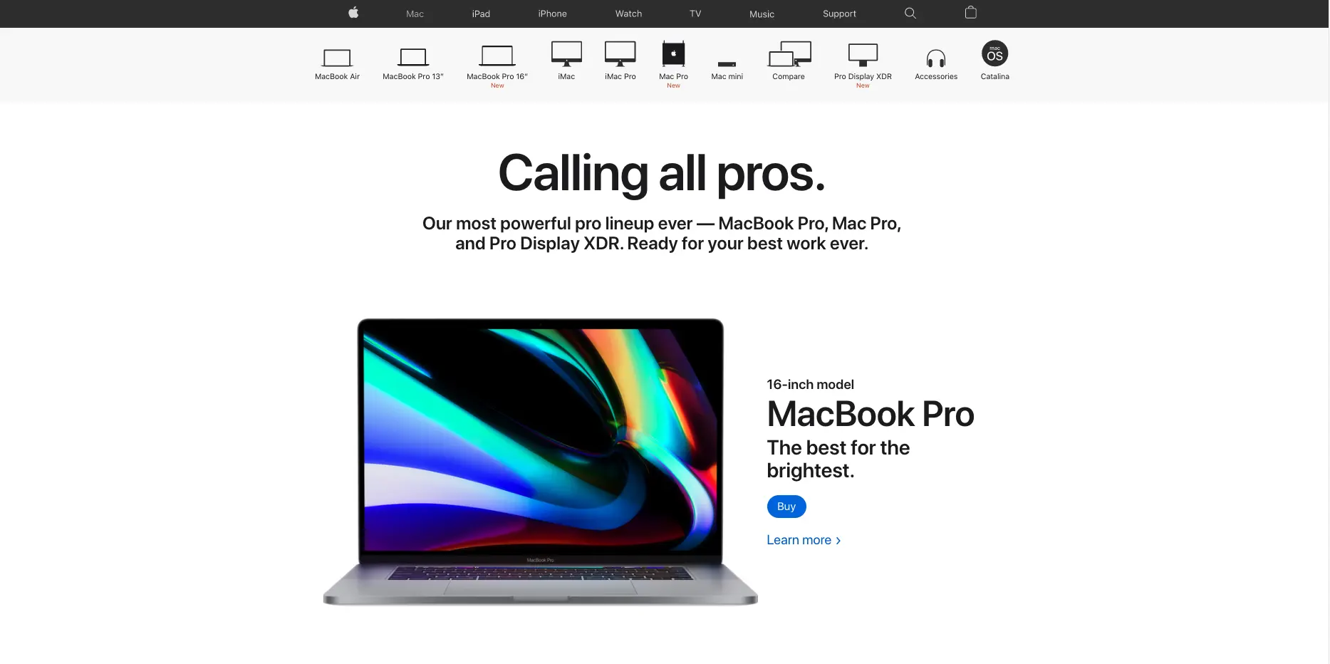
One of the best ways to achieve simplicity is by maximizing whitespace. Whitespace is exactly how it sounds — space containing nothing, or “inactive” space. It’s called whitespace because the background of many visualizations is white, so the “nothing” in this case is literally “space that’s white.” You can see examples of this concept by looking at websites such as Apple’s:
And Dropbox:

Both of these websites make great use of whitespace, leaving considerable empty space around the main elements of each page. Only a small amount of space is taken up by the elements themselves (“active” space), and the total number of textual and pictorial elements has been kept to a minimum. This ensures viewers remain focused on the elements that are there.
Consider the following xkcd visualization about money. It displays a considerable amount of information, to the point where it’s not immediately clear what the viewer should focus on or how to interpret the information:
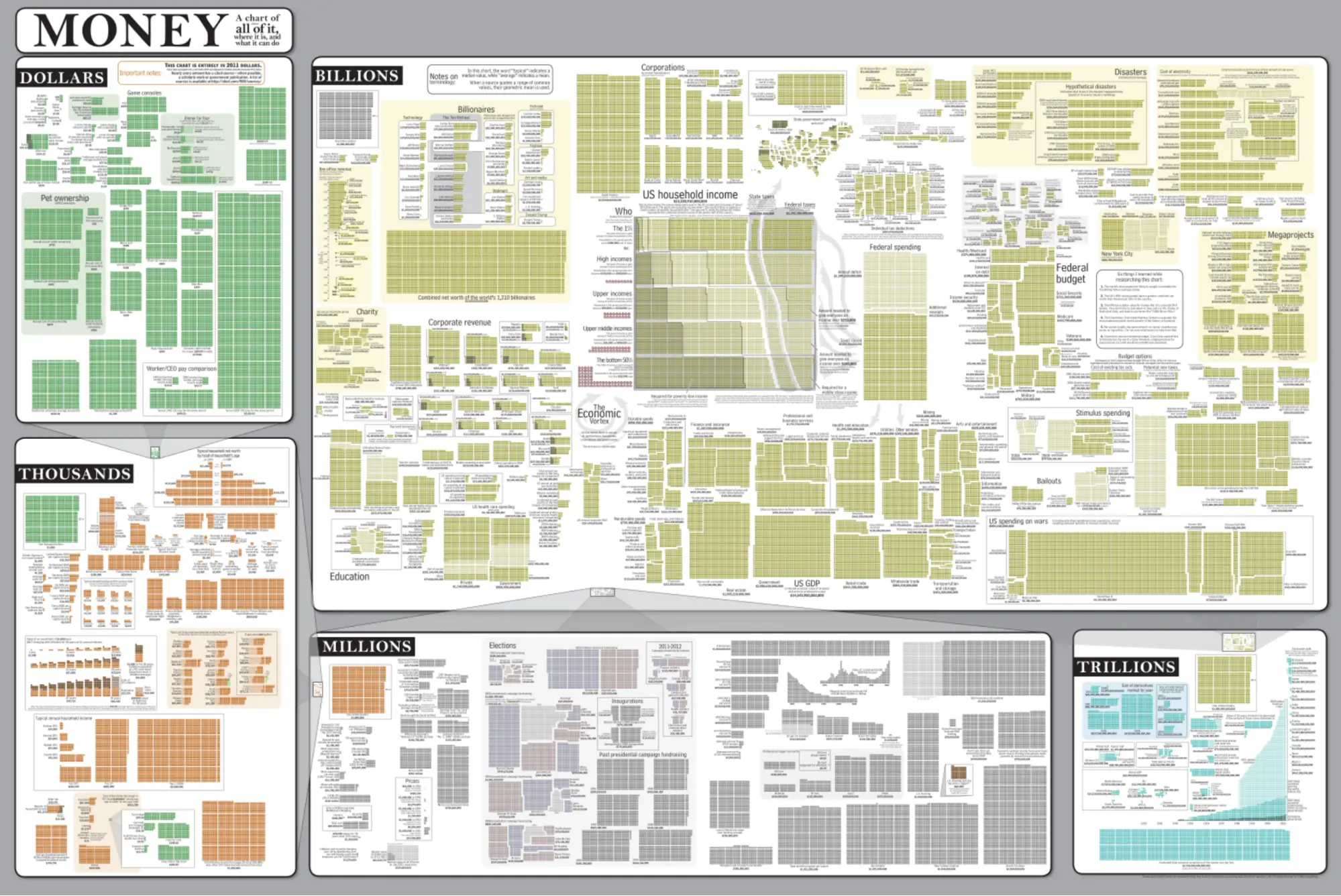
As you can see, an incredibly large amount of information has been squeezed into the visualization, leaving very little whitespace or space between the components. In trying to put too much information into one visualization, the author has overwhelmed the viewer, rendering the visualization ineffective.
As mentioned earlier, simplicity is one of the hardest design principles for analysts to adhere to when it comes to creating data visualizations; however, it’s an incredibly important overarching theme. Any time you add a new element to your visual, whether it be textual or pictorial, ask yourself what information it adds. Could the user see or understand the same information without the extra labels or symbols? Is the attention of the viewer drawn to the important aspects of the visualization? Would you be better off breaking the visual into multiple visualizations?
1.4. Size
Size is a somewhat obvious—but still important—component of visualization design. In the previous Exercise, you learned about Charles Louis de Fourcroy’s revolutionary Tableau Poléometrique (1782), in which he used differently sized squares to represent cities in Europe according to their populations:

Fourcroy’s chart was the first to make use of proportional representation—a principle that states that the size of elements in a visualization should correspond to magnitude.
Referring back once again to Minard’s visualization of Napoleon’s Russian campaign, you can see how he uses the size of the horizontal lines to represent the size of the army. Each millimeter in his map corresponds to 10,000 soldiers, effectively representing magnitude and direction at the same time.
Let’s switch gears for a moment to look at another example, this time about NBA teams. Each pie in Figure 10 below corresponds to a different NBA team, and the size of each segment within a pie corresponds to how the team performs in one of the four key areas of the game—shooting efficiently, taking care of the ball, offensive rebounding, and getting to the foul line:
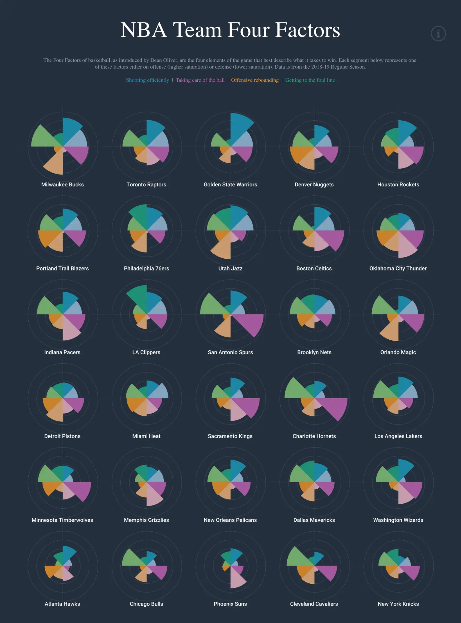
As you can see, the size portrays the magnitude of each category, making it similar to the polar area diagram, or Nightingale Rose, you first saw in the previous Exercise. When using pie segments — or anything else, really, be it dots, circles, symbols, bands, or otherwise — to communicate magnitude or scale, larger elements should always signify greater magnitude.

As a rule of thumb, symbols representing discrete sizes shouldn’t include more than five categories; otherwise, it becomes too difficult to differentiate the sizes. In addition, you should always include a legend to display the range or value of each size. While the dots in Figure 11 above represent discrete sizes, both the Minard and NBA examples employ ranges, instead.
1.5. Color
As touched on a few times already throughout this Exercise, color is an additional aspect of data visualization that requires consideration. Think of color as another way of communicating information rather than a chance to simply select your favorites or make the visualization look “pretty.” Minard, for instance, used two colors in his visualization. The lighter tan color portrayed the army’s advancement towards Moscow, while the darker black color portrayed the army’s retreat. Without this use of color, the difference between these two lines would have been difficult, if not impossible, to see, which would have obfuscated the information Minard was trying to convey.
Let’s take a look at a few more examples of color before discussing some effective strategies for using color in your own visualizations.
1.5.1. Meaningful Color Schemes
A great example of a meaningful color scheme is the traffic light scheme. Because it’s recognized internationally, it makes an excellent choice for conveying information across borders. The U.K., for instance, uses the traffic light scheme in food labels to indicate the quantity of certain components in food and how much of your daily recommended intake they monopolize:

The colors used in Figure 12 above indicate whether the food contains desirable or undesirable amounts of different ingredients based on the recommended daily amount for adults. The green signifies “desirable” or “good.” You can see that the amount of sugar falls within this desirable amount. Yellow, on the other hand, is neutral, suggesting that the ingredient doesn’t exceed the daily allowance but shouldn’t be consumed in abundance either. Here, the saturates fall into this category. Lastly, red is “undesirable” or “not good.” You can see that both the fat and salt in this food exceed the recommended daily amount. Even without a legend explaining the colors, the use of the traffic light scheme makes it easy to intuitively understand what the colors represent.
Red, green, and yellow aren’t the only colors that can communicate information universally. Suppose, for instance, you wanted to display information about a geographical area that included both land and water. Logically, people are going to associate water with blue and land with green, making those two colors an intuitive choice for your visualization.
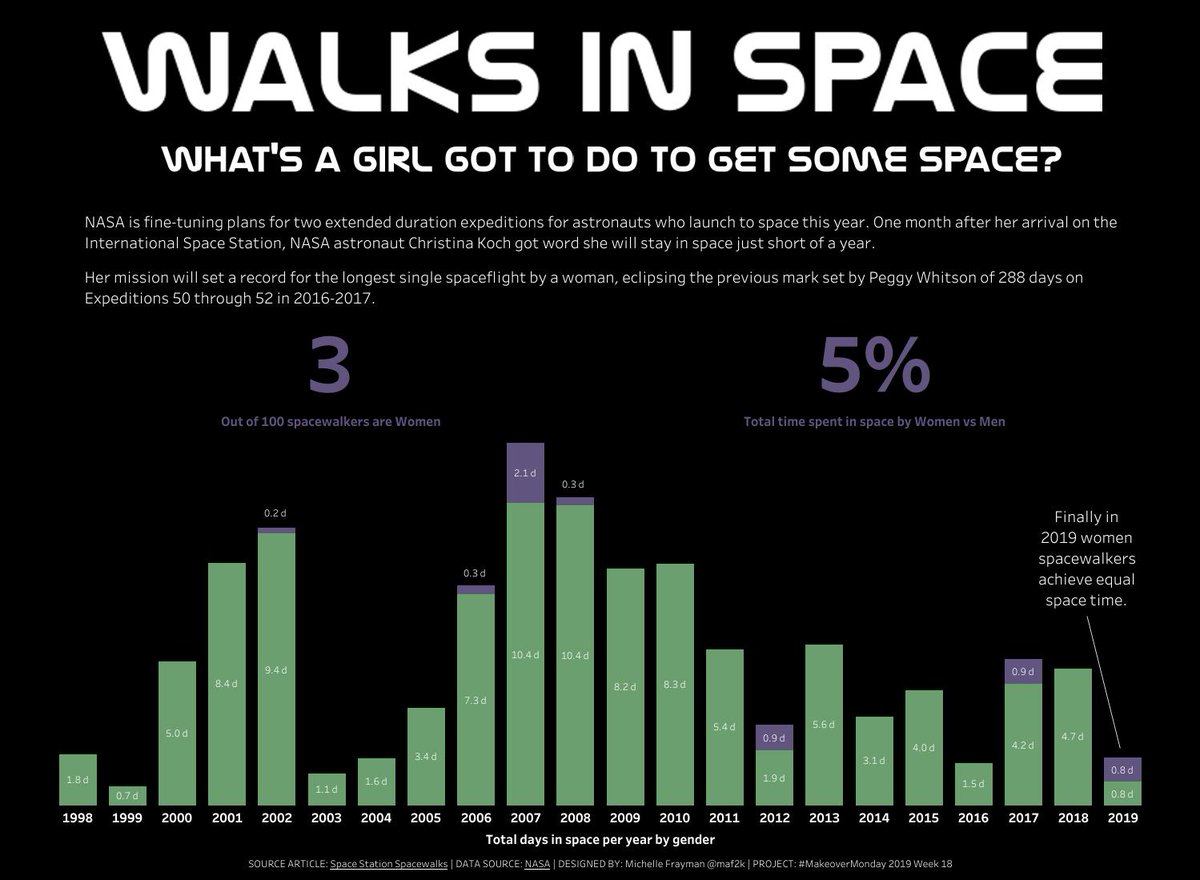
There are, however, times when color can be interpreted in unintended ways, for example, by fostering certain stereotypes. Let’s take a look at an example. The visualization in Figure 13 below exemplifies the inequality between men and women when it comes to time spent in space, with purple representing women and green representing men. While blue and pink would have been the obvious choice, such a color combination could have led to unfavorable stereotypes about gender, making it a choice best avoided. By choosing purple and green, the designer of the visualization ensured the information was clear without fostering stereotypes about traditional gender roles:
1.5.2. The Color Wheel
A basic understanding of color theory can help greatly when developing color schemes for your visualizations. Let’s walk through a few fundamentals you may remember from art class to get you started.
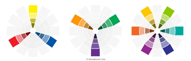
To start off, a color wheel is a system for organizing colors and one that’s widely used for creating harmonious color palettes or schemes. A color wheel displays primary, secondary, and tertiary colors, along with the relationships between them:
-
Primary colors (left, above) are those that can’t be created by mixing other colors and are generally considered to be red, blue, and yellow. In traditional color theory, these three colors can be mixed to make secondary colors.
-
Secondary colors (center, above) include green, orange, and purple. These are colors formed after mixing two primary colors; for example, yellow + blue = green.
-
Tertiary colors (right, above) are a bit more complex, with examples ranging from yellow-orange to red-orange and blue-green. They’re formed by mixing a primary color with a secondary color, which is what results in their two-hue names.
Primary, secondary, and tertiary colors are known as hues. Adding white, gray, or black to a hue changes its appearance: adding white changes the tint, adding black changes the shade, and adding both black and white together changes the tone:

Colloquially, these terms are often used interchangeably; for instance, a change from light blue to dark blue could be considered a change in tint or shade. Throughout this Exercise, however, we’ll use the term “hue” to refer to any sort of difference in color. For example, the terms “pink,” “light pink,” “grayish pink,” “blackish pink,” and “lightish red” will all be referred to as variations on the “pink” hue.
1.5.3. Harmonious Color Schemes
Color harmony is the practice of combining colors in a way that’s pleasing to the eye. When achieved, colors are engaging, balanced, and pleasant. When not achieved, colors can be chaotic and uncomfortable to look at. While there are a number of different tools out there for creating harmonious color schemes (which you can find in the Resources section at the bottom of this Exercise), there’s also some tried-and-tested best practices you can follow on your own. Color schemes, here, refers to specific ways of combining colors using a color wheel. Let’s take a look at a few useful schemes for your own data visualizations.
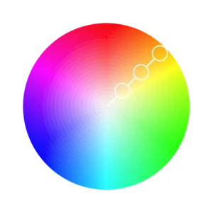
With just one hue, you can create a monochromatic color scheme. The “mono” prefix, as you might already know, is used to signify a single item. Here, it signifies a single hue. Variation on this hue is created by using shades, tones, and tints. The colors indicated by the white circles in the color wheel below, for instance, are all variations on the same hue and could be used in a monochromatic color scheme:
Accessibility Tip!
Most people who are color blind can see shades, tones, and tints. This means monochromatic scales are often color-blind-friendly—or accessible—choices. We’ll be consolidating some accessibility tips for you later on in this Exercise.
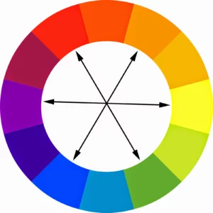
Complementary colors are colors that are opposite each other on the color wheel. Examples include yellow and purple, blue and orange, and red and green:
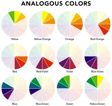
Analogous colors are colors next to each other on the color wheel. A quick and easy way of creating a color palette involves choosing three analogous colors. These also tend to be the colors you see together in nature; for instance, autumn leaves can be represented by “warm” colors like red, orange, and yellow, while snow and ice can be represented by “cold” colors like blue, green, and purple. When choosing analogous colors, you’ll usually choose from the warm or cold spectrum:
Complementary colors and analogous colors are visually agreeable and harmonious combinations. When using these color schemes, be sure to make use of changes in tint, tone, and shade to ensure harmony throughout your visualization. For instance, people’s eyes are naturally drawn to darker hues—you can use this knowledge to ensure the key focus areas of your visualization are darker. No matter what color scheme you go with, always aim for two to five colors—no more. This will ensure your visualization adheres to the principle of simplicity!
You’ll also want to make sure your colors don’t contrast poorly with the text in your visual. Using poor color combinations for text and background can create extreme dissonance, which is something you should avoid (for everyone’s sakes!):

As mentioned above, don’t forget to use a legend when using color to communicate information! Always add a color legend when using more than two colors.
As you can see, there isn’t a single “golden rule” driving color decisions. Instead, there are many factors to consider and no “correct” way to design your visualization. There are, however, some key questions you should keep in mind when making your choice:
- Is there already a natural color scheme implied by your data (e.g., blue water)?
- Is your color combination aesthetically pleasing (e.g., a monochromatic scale, complementary colors, or analogous colors)?
- Have you chosen more than five colors?
- Have you considered using tints, shades, and tones to make the colors more accessible?
- Do the darkest colors of your visualization represent the most important parts of your information?
There’s also the color scheme of your organization to keep in mind. Does your company already have certain colors they use for imagery and visuals? This can be especially important if you’re presenting to an outside audience as an ambassador of your company.
1.5.4. Grouping with Color
One additional consideration is the theory of grouping, a concept described in Gestalt psychology. According to the theory of grouping, people naturally perceive objects in patterns. For instance, one of the most relevant groupings for creating data visualizations is the principle of similarity. This principle states that items with similar shapes, colors, and sizes are perceived as a group, regardless of whether or not they’re located next to one another.
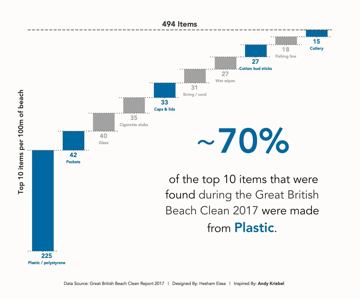
Let’s take a look at an example. The visualization in Figure 20 below shows different types of waste collected during a beach cleanup in Great Britain. The visualization emphasizes the amount of plastic waste by grouping waste into “plastic” and “non-plastic” categories—the bars and text related to plastic are depicted in blue, while everything else is depicted in gray. In this manner, the designer created natural groups simply through their use of color:
1.6. Accessibility
So far in this Lesson, you’ve explored the use of text, space, size, and color as a means of creating compelling data visualizations. As a visualization designer, your goal should always be simplicity, as this ensures your visualizations will be effective in communicating (the right) information; however, there’s a final point to consider when designing visualizations: accessibility.
In case this term is new to you, accessibility refers to ensuring your visualizations are usable (“accessible”) by everyone who uses them. When designing visuals, you want to be inclusive of as many people as possible, even those with permanent, temporary, or situational disabilities:

Let’s start with the use of color. Not everyone sees the whole spectrum of colors—in fact, color blindness impacts 1 in 12 men and 1 in 200 women worldwide (according to Color Blind Awareness). There are different variations of color blindness ranging from red/green color blindness to total inability to see any color. Red/green color blindness, where individuals have trouble differentiating between red and green, is the most common. Such individuals also have difficulty seeing colors that contain red and green, such as purple (purple is made by mixing red and blue).
How can you ensure your visualizations are accessible to those with color blindness? Much of this comes down to your choice of color scheme. Monochromatic color schemes, for instance, work well thanks to the contrast between colors. Additionally, many data visualization programs include suggestions that accomodate color blindness, such as ColorBrewer. The color schemes created with ColorBrewer are so well done and widely utilized that they’ve even been incorporated into various visualization software, for instance, R and ArcGIS (a mapping software).
Another way to make your visualizations more accessible is by always using more than one signifier to get information across, especially when using color. If color were the only thing used to differentiate two elements on a visualization, someone with color blindness wouldn’t be able to tell the difference, rendering the visualization useless. Whenever you use color, make sure you also include supplementary text or symbols deciphering the meaning behind the visual component.
Another aspect of accessibility is text alternatives, or “alt text.” You may already be familiar with alt text on the web—text that appears if an image can’t be loaded on a website:

Alt text can also be used within visualizations, allowing screen readers to read aloud a description of the visualization for those with visual impairments. You can also provide accompanying tables as an addendum to the visualization or as a second, accessible format for viewing.
Other tips for enhancing the accessibility of your visualizations include using readable text labels (in terms of size, font, and contrast with the background), as well as descriptive titles and labels that tell the viewer more about what the visual is communicating. Ultimately, the more accessible your visualization is to those with severe or permanent disabilities, the more useful it is to everyone.
2. Checking Your Visualizations
While some design principles are more guidelines than rules, it can still be helpful to keep a list of essential components at your side as you begin designing your visualizations. This can serve as a sort of checklist as you plan and assess your work (or review the work of others!).
Text
- Are the title and text descriptive enough? (i.e., do you understand what the visualization is trying to convey just by looking at the title and text?)
- Are there text labels?
- Does the text portray any redundant information that could be gotten rid of?
- Do colors, shapes, and size scales come with legends?
Color
- What does the color scheme signify?
- Are there more than five colors?
- Does the color scheme make sense? Are colors analogous, complementary, monochromatic, or intuitive?
- If color is used to draw attention to important information, is the darkest color representing the most important information?
Other
- Are different sizes used? If so, is there meaning behind the sizes?
- Are there groupings in the data that can be portrayed through color, size, or position?
- Is there (enough) whitespace?
- Is the visualization accessible?
- Does the visualization teach you something?
As a note on the last bullet point—when an analyst reaches the point of evaluating a visualization, asking whether that visualization teaches you something is important. If the visualization doesn’t present usable, understandable information in a clear, teachable manner, it hasn’t fulfilled its purpose. It could be, for example, too cluttered, in which case, the analyst should simplify and declutter the graphic.
Let’s practice using this checklist to evaluate an example:

Text
- Yes, the title is good. (+)
- Some countries and regions are labeled. (+) The country labels seem a bit random. (-)
- The region labels are redundant with the colors. (-)
- The axes haven’t been clearly labeled. (-)
- A color legend is included. (+)
Color
- The colors signify the region. (+)
- While there are six colors, they signify the six world regions, so it’s okay to use more than the rule of thumb. (+)
- Each color signifies a region. Europe and the former Soviet Union appear related due to their similar colors (red and pink). Sub-Saharan Africa and the Middle East and North Africa also appear related due to their similar colors (shades of blue). (+) However, it’s unclear whether these relationships are intentional because the overall color choices are random. (-) A better choice would be:
- Asia: orange vs. Americas: blue (complementary colors)
- Sub-Saharan Africa and Middle East/North Africa: dark/light green vs. Europe and the former Soviet Union: dark/light red (complementary colors)
Other
- Size isn’t used. (neither + nor -)
- Regions are the only groupings represented. Countries could have been grouped by size above and below the median line. (-)
- There’s reasonable use of whitespace. (neither + nor -)
- The text is readable, and the colors are clearly distinguished. (+)
- I could clearly see the countries with the lowest and highest proportions of people thinking vaccines are safe. (+)
As you can see from the example, this checklist is particularly handy when reviewing visualizations — it’s also a process you’ll be following throughout the remainder of this Module. As you progress, your critique may move from a checklist format to a more comprehensive narrative, but the elements included will be the same.
Style Guides
Design is a field in and of itself, and, in fact, there are a great many techniques that can improve the look and effectiveness of a data visualization. Some companies even create internal style guides to ensure all their visualizations are effective and consistent. Style guides are, essentially, lists of rules on how to format and represent information in a visual format. They can include company color schemes, logo placements, guidance on when to use which visualization tools, and more. Because many companies lack this guidance, however, it can be helpful to create your own style guide. The Resources section at the end of this Lesson links to a website describing different style guides. You’ll use these along with the information in this Lesson to create your own style guide you’ll be able to reference throughout the rest of this Module.
3. Tableau
You’ll be using a program called Tableau throughout the remainder of this Module. Tableau is a leader in the field of business intelligence and an industry-standard tool for data visualization.
3.1. Tableau Products
The version of Tableau you’ll want to install is called Tableau Public. The benefit of Tableau Public is that it’s free (unlike the standard version of Tableau); however, it has two downsides. First, you can’t store any of your work locally (on your own computer). Instead, you need to publicly publish your visualizations online (hence the name “public”). Second, you won’t be able to copy sheets from one Tableau workbook to another. That means you might have to recreate some graphs; however, this will give you more practice honing this skill! You’ll be using Tableau Public to design visualizations, share your work, and create a final portfolio piece at the end of this Module to grow your online portfolio. You can also use it as a great source of inspiration, so be sure to browse it often!
The core Tableau product used by professional data analysts is Tableau Desktop, which includes the most functionality of any of the Tableau products. To use Tableau Desktop, however, you need to purchase a license, which is quite expensive. As many organizations can’t share their data online (as would be the case with Tableau Public), they’re required to buy this more-private version of Tableau. You, however, won’t be working with any private information for your projects in this course, so Tableau Public will be fine for your purposes.
Tableau Desktop has an accompanying product called Tableau Prep for manipulating and restructuring data before building dashboards. It requires an additional license (and is neither commonly used nor necessary), so you won’t be using it in this course.
3.2. Installing and Opening Tableau
Tableau Public is very easy to install. Simply download the desktop app from the Tableau Public homepage, then follow the onscreen instructions. Along the way, you’ll be prompted to create an account. Once it’s finished installing, open it up, and you’ll be met with the following screen:
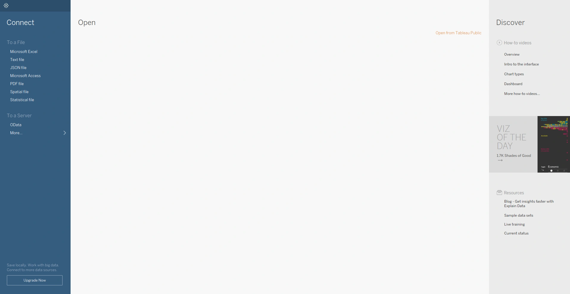
On the left side is your file menu, which you can use to quickly load a data set. While you’ll be focusing on Excel files for this Exercise, note that Tableau supports a number of different file types; for instance, text files, PDF files, JSON files, and more.
Let’s practice using Tableau to connect to an Excel file! To follow along, download this Excel file of candy data (.xlsx).
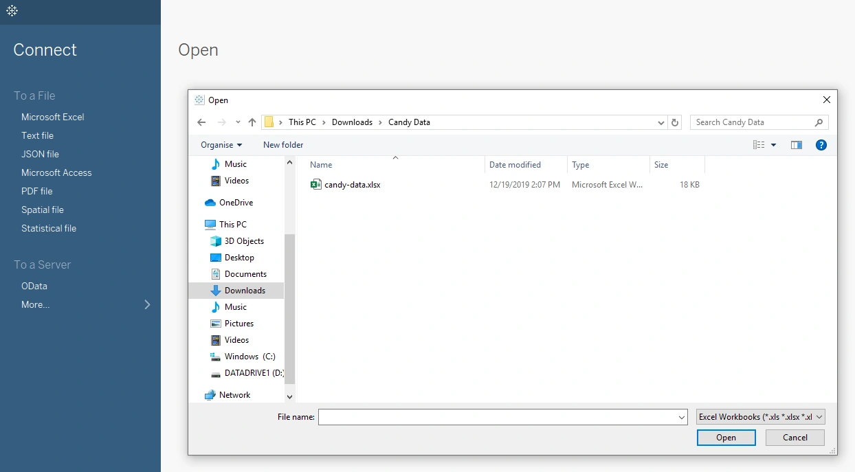
Microsoft Excel is usually the first option under the To a File connection under the left-hand menu (if you don’t see it, choose the More… option). After selecting Microsoft Excel from the menu, find the “candy-data.xlsx” file you just downloaded and click Open.
After connecting to the file, Tableau will open the Data Source screen. Take a look at the left-hand menu where, again, you’ll find a number of important components. Under Connections, Tableau displays the name of the raw file you just connected to (in this case, “candy-data.xlsx”). Under Sheets, Tableau displays two options: candy-data and metadata. These correspond to the two tabs in the Excel file.
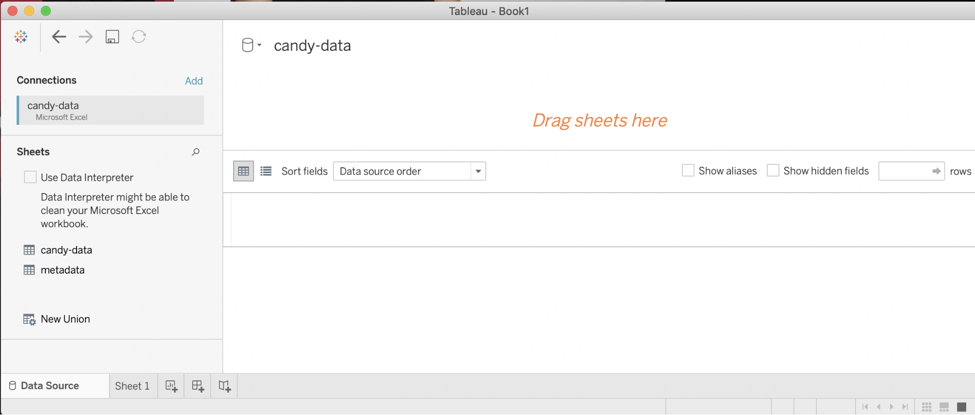
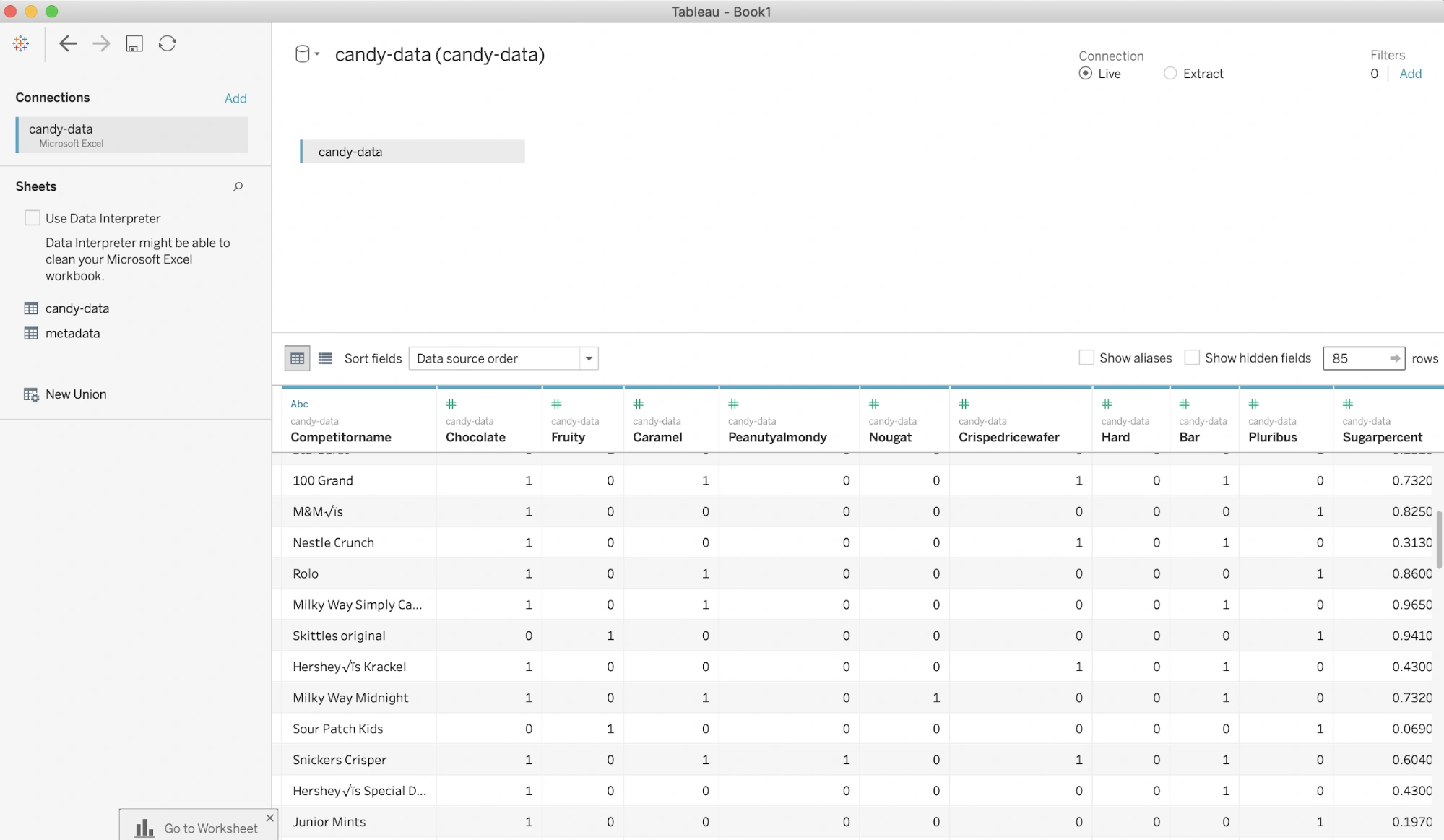
Double-clicking on one of these sheets will load a preview of the data. The candy-data sheet, for instance, loads a preview of the data in the “candy-data” sheet. In this example, “candy-data” is the name of the Excel file and the tab within that Excel file. However, the white preview section in Tableau is only a preview of the single Excel tab—not the whole file!
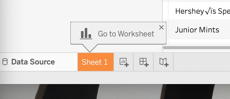
At the bottom of the screen, you should see a small Go to Worksheet dialog pointing to the Sheet 1 button. Click this button to open the complete file:
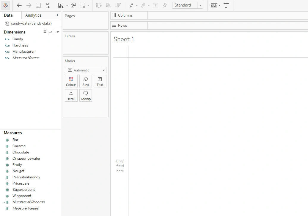
Clicking on Sheet 1 will open up the main interface for building your data visualizations. While you won’t be starting this until the next Lesson, let’s quickly glance at two important features: Dimensions and Measures. You’ll find both of them listed under the left-hand menu. However, of key note here is the fact that your Dimensions and Measures may look slightly different depending on the version of Tableau you’re using. For the purpose of the screenshots in this course, the Dimensions and Measures areas of Tableau look like this:
Newer versions of Tableau Public, however, don’t include labels for the Dimensions and Measures areas, like so:

However, no matter which version you’re using, all of the functionality is the same—it’s simply that the labels aren’t there. As such, don’t worry about which version you’re using or if the screenshots in the material differ slightly from what you see on your screen. What you need to do with the software will remain the same!
Tableau automatically classifies your data into two categories: dimensions and measures. Generally speaking, dimensions are text or categorical data and are shown in the top-left corner of the dashboard. As you can see in Figure 29 above, the three dimensions for this data set include Candy (name), Hardness, and Manufacturer.
Measures, on the other hand, refer to numeric data, or data on which you’d perform some kind of mathematical operation. They’re displayed below dimensions in the left-hand menu. In this data set, the measures include Bar, Caramel, Chocolate, and more. While there’s some nuance to these descriptions, those will be addressed throughout the Module as they arise. Whether a variable is a dimension or a measure will impact the type of visualization you can create with it. You’ll learn more about which data types different visuals require in future Lessons.
You’ll also notice that some data is green and some is blue. Data colored blue is discrete, which means it has a finite range and that you can count it. You’ll use it often for things like headers of your charts. Green data is continuous, which means it can be an infinite number of different things, and you won’t be able to break it down into countable numbers. You’ll use it more often in the axes of your charts. Dimensions are more often discrete (blue), whereas measures can be either discrete (blue) or continuous (green). Don’t worry if you don’t remember these definitions—you’ll revisit this concept in the next Lessons!
3.3. Excel vs. Tableau
Because you’re now using two programs at once, it’s important that you think about how you use them together. First, why are you using two programs? The answer—because they provide different functions. Excel is an analysis, computation, and statistical tool that also provides the ability for some really cool graphs. Tableau is a visualization tool, meaning it can create much more intricate charts, graphs, and even interactivity than Excel. However, it’s not as good at computation as Excel. You can also create new variables and calculated fields in Tableau, but it’s much more difficult than in Excel.
When using multiple tools for the same analysis, always think of their strengths and weaknesses. You may be able to create the same graph in Excel as in Tableau, but it might take a lot more time. Conversely, you might want to dig back into the data and create some new variables once you see a certain visual in Tableau, but it might be easier to go back into Excel to do that, then re-import your data.
Finally, because you have two sources of information, you might need to make changes in one tool to affect another. Sometimes, the data you import into Tableau won’t be able to generate the chart you want because of the format or layout it’s in. There’s nothing wrong with going back to the original data in Excel and reformatting it so that it displays better in Tableau! Just because you’re using a new tool, it doesn’t mean you’re stuck using it all the time!
Summary
Congratulations! You’ve just taken the first step to creating truly beautiful and effective visualizations. Analysts can learn a lot about effective visualization design from graphic design principles—everything from size to color to layout and whitespace. While it’s effective to learn these principles, a lot of the intuitive feel that comes with creating clean, effective visualizations will come with more exposure to different kinds of visualizations—as well as plenty of practice!
At this end of this Lesson, you took your first peak into the world of Tableau, which is what will allow you to get off to a running start in the next Lesson when you begin work on your first visualization! Before that, however, let’s take some time to put together a style guide you’ll be able to refer to throughout the rest of the Module. To the task!
Suggested Readings & References
- What to Consider When Choosing Colors for Data Visualization
- What are Data Visualization Style Guidelines?
- The Key to Clean and Uncluttered Infographic Design Whitespace
- Inclusive Web Design: Why Our Websites Should Be More Accessible
- Add Alternative Text to a Shape, Picture, Chart, SmartArt Graphic, or Other Object
Exercise
Estimated Time to Complete: 1-3 Hours
In this Exercise, you’ll create a style guide you’ll be able to reference throughout the rest of this Module—and maybe even your professional life! You’ll then use this guide to critique a visualization found on Tableau’s share site, Tableau Public. Finally, you’ll install Tableau Public on your computer and connect it to your data set from previous Exercise.
Directions
- Explore the Tableau Public Gallery and choose a visualization to review.
- In a Word document, review the visualization using the visualization checklist provided in this Lesson.
- Remember to include in your review an assessment of the visualization’s accessibility.
- Additionally, include a short paragraph explaining what you learned from the visualization.
- After reviewing the visualization, explain how you’d improve 1–2 components the designer did poorly (e.g., color choice, use of size, lack or overuse of labels, etc.).
- Add at least one additional point to your checklist based on the visualization. Was there anything about the visualization that should have been touched on but that wasn’t covered by the checklist? Did conducting the review bring to light any other aspects of a visualization not included in the checklist? This altered checklist will become the style guide you’ll be able to reference throughout the rest of this Achievement.
- If you didn’t already install Tableau Public while reading the Lesson, do so now. You can find the download link on the Tableau Public homepage. Remember, we’re installing Tableau public and not the standard Tableau – you won’t be asked to make any payments or enter any card details.
- Use Tableau to connect to your cliqz dataset. You’ll be using the integrated data set you created in Lesson 1 as your primary data source. The data source will be an Excel connection.
- Take a screenshot of Sheet 1 after connecting to the data and add it to your Word Document.
- Below it, include a list of which variables are dimensions and which are measures.
Hint: If the columns in your first worksheet look like F1, F2, …. then Go back to your Data Source tab, and select the Use Data Interpreter option. This should enable Tableau Public to convert the columns into their respective column names.
- Your final Word document should include a link to the visualization you reviewed, your altered checklist (style guide), the screenshot of Sheet 1 in Tableau, and the list of dimensions and measures.
- Export your Word document as a PDF and upload it in the drive for your mentor to review.
Submission Guidelines
Submit your solution as the pdf or doc mentioned above.
Filename Format:
- YourName_Lesson2_VisualizationBasics.docx
When you’re ready, submit your completed exercise to the designated folder in OneDrive. Drop your mentor a note about submission.
Important: Please scan your files for viruses before uploading.
Submission & Resubmission Guidelines
- Initial Submission Format: YourName_Lesson#_…
- Resubmission Format:
- YourName_Lesson#_…_v2
- YourName_Lesson#_…_v3
- Rubric Updates:
- Do not overwrite original evaluation entries
- Add updated responses in new “v2” or “v3” columns
- This allows mentors to track your improvement process
Evaluation Rubric
| Criteria | Meets Expectation | Needs Improvement | Incomplete / Off-Track |
| Visualization Checklist and Setting up Tableau |
|
|
|
Got Feedback?
Contact
Talk to us
Have questions or feedback about Lumen? We’d love to hear from you.